Bestway

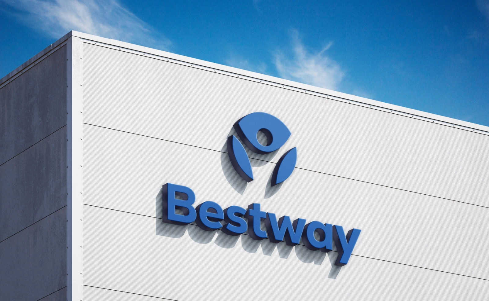
Visual identity, Brand guidelines, Signage
2026

1.0 The challenge

Patients arrive at a hard moment. The brand had to feel warm without losing the seriousness of a high-end clinic.

2.0 What we did

We designed a human figure with open arms inside a protective circle, in a blue that conveys calm and trust. We defined a simple system that works the same on a facade, a badge or an app.
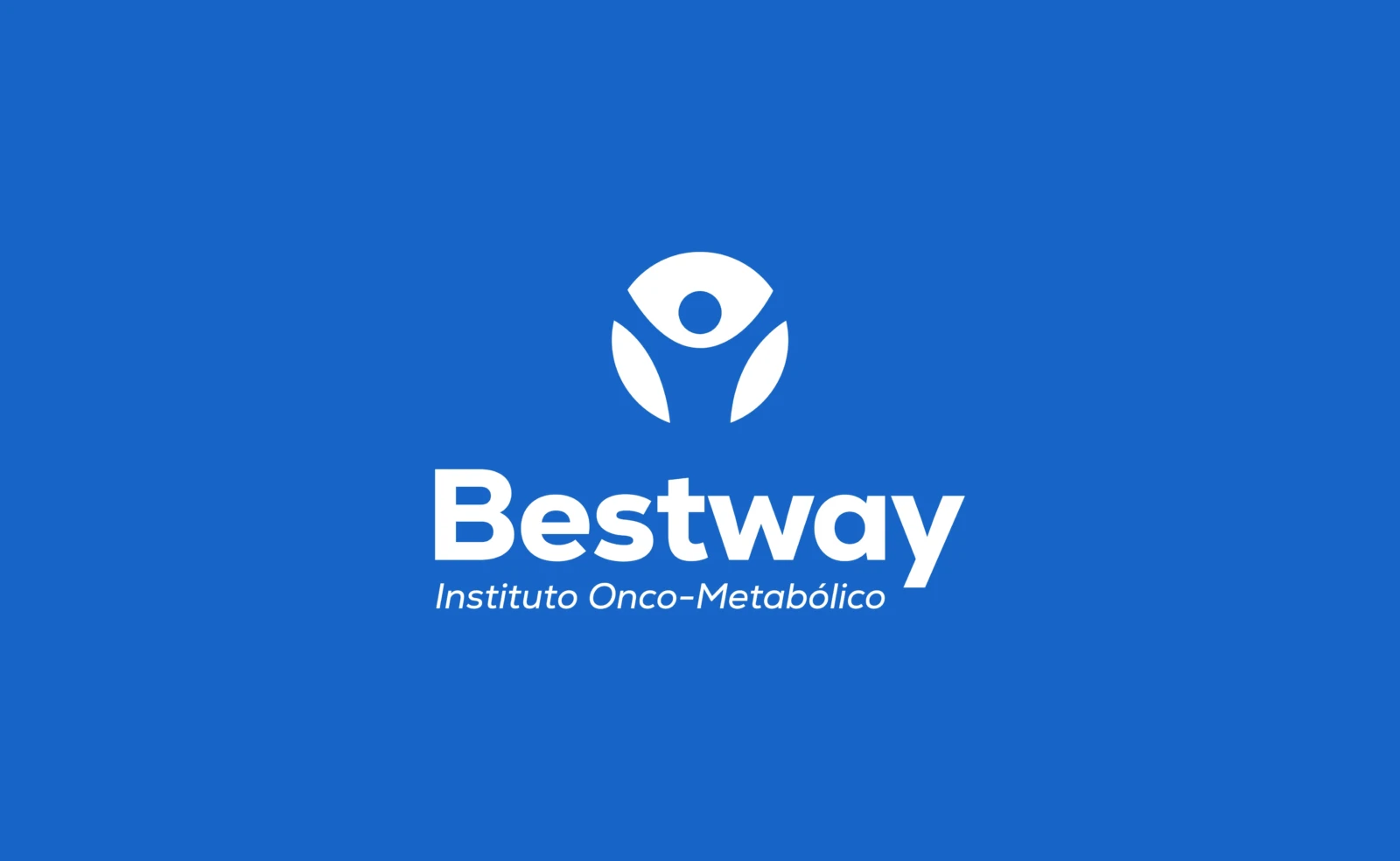
The logo on the institutional blue.

The symbol

A person rising with open arms, held by a circle. The patient at the center, the medical team around them.
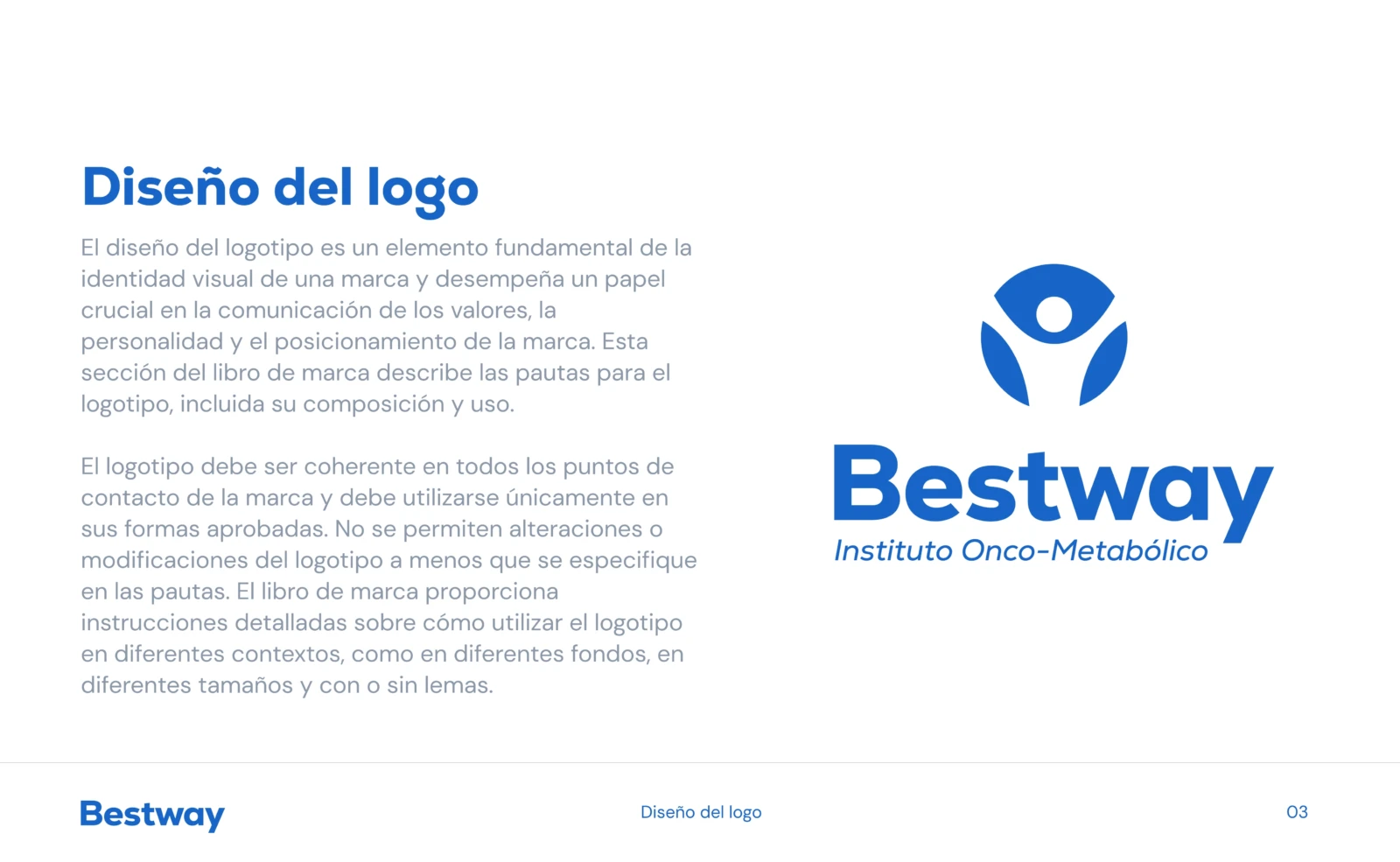
Logo construction and usage.
Version on teal.
Version on teal.
Version on dark.
Version on dark.
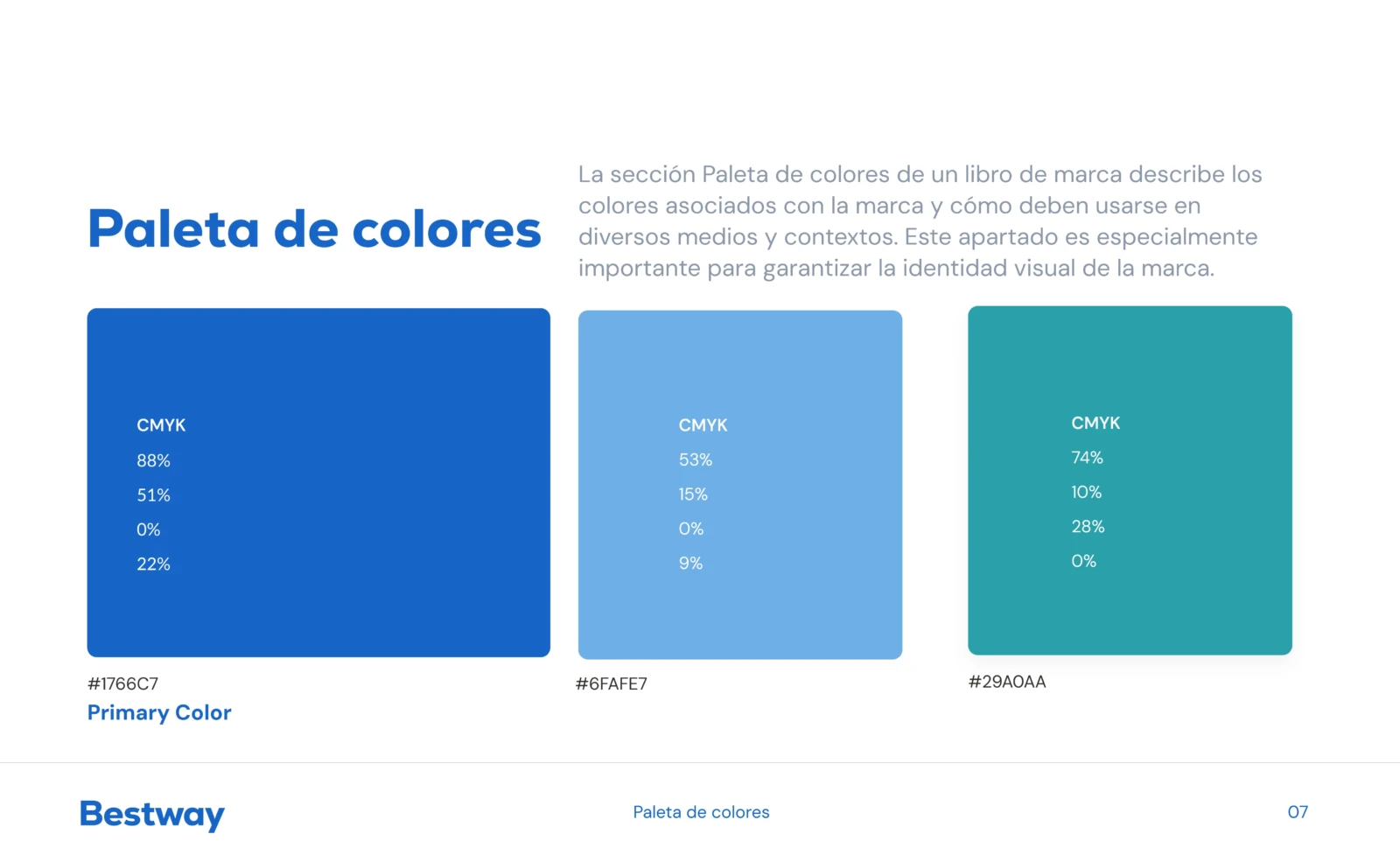
Primary palette.
Primary palette.
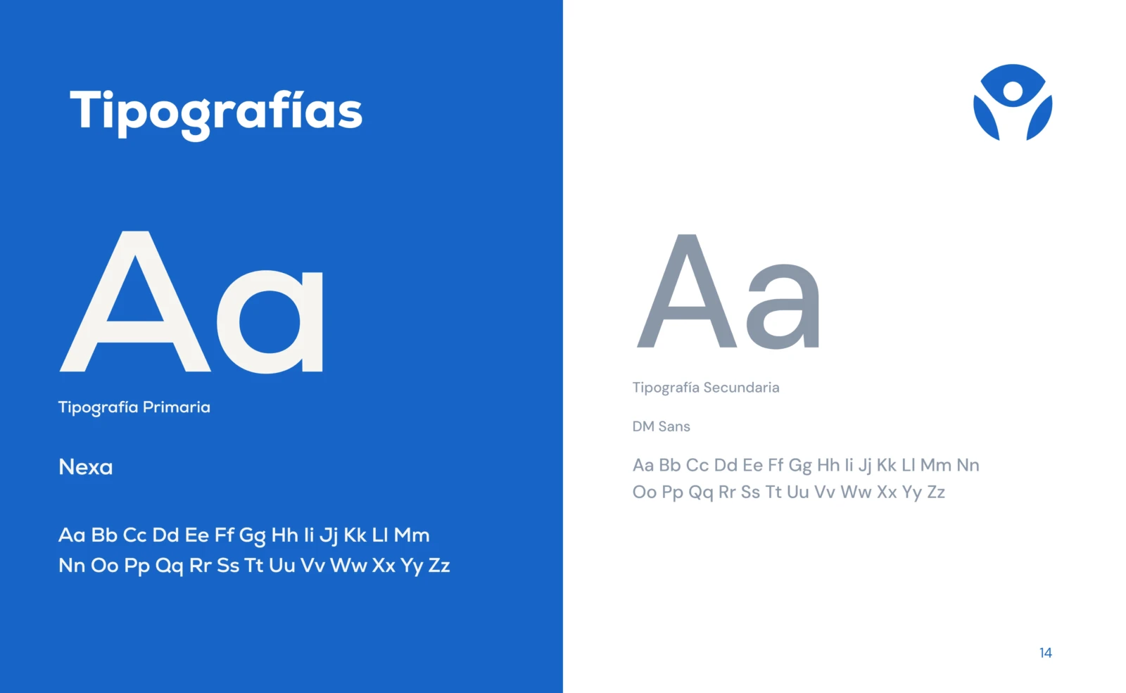
Nexa and DM Sans, the brand typefaces.
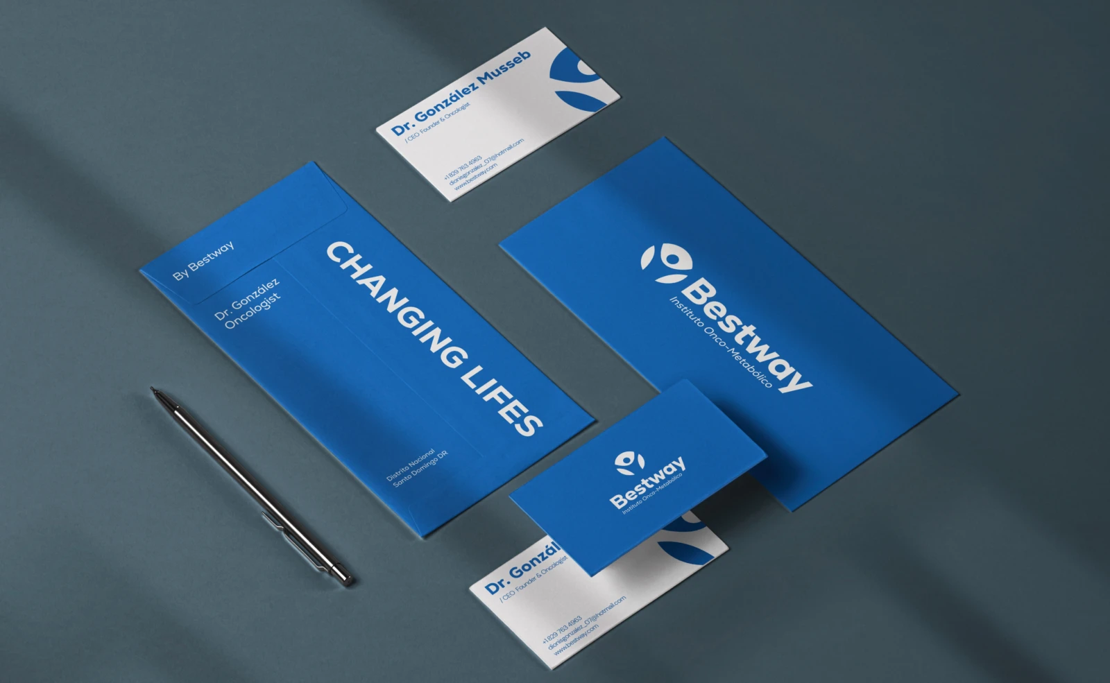
Stationery and cards for the medical team.
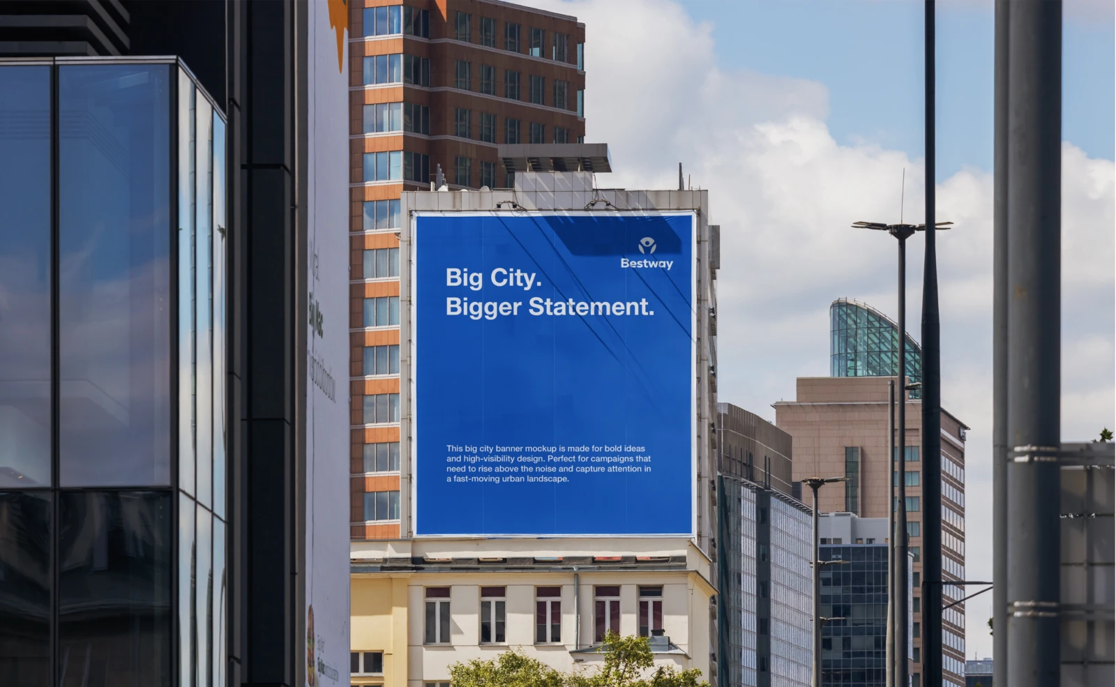
Outdoor campaign.
Outdoor campaign.
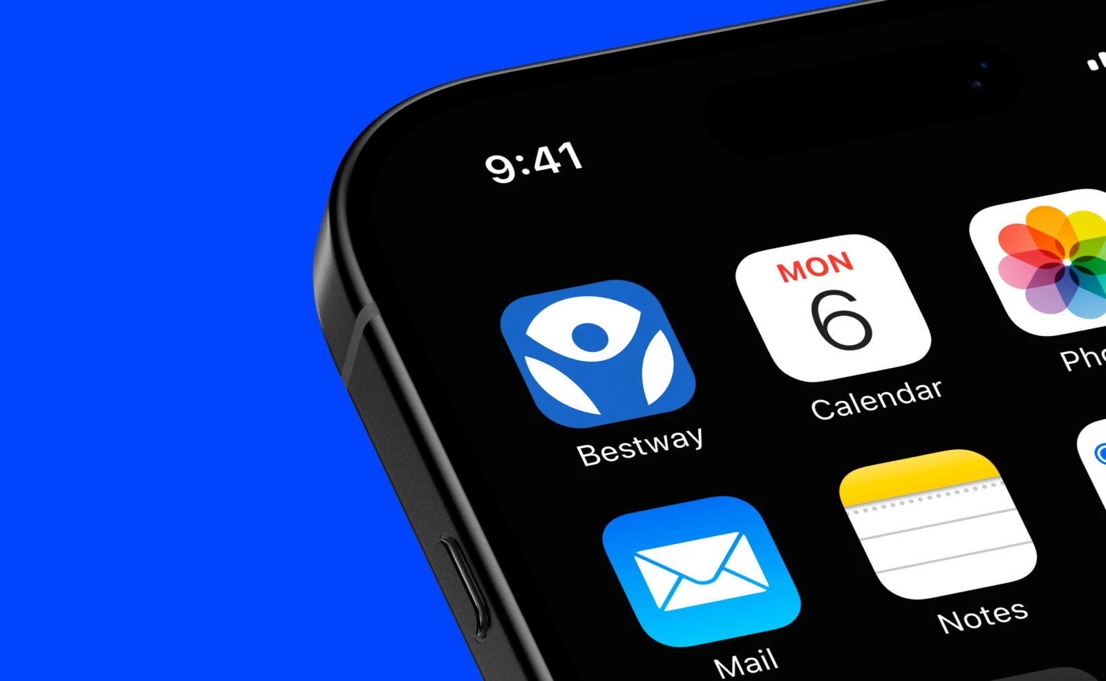
Icon for the institute's app.

3.0 Outcome

The new identity rolled out across the building, medical stationery and digital channels, and became the face of the institute's campaigns.