Ing. Edwin White

Strategy, Visual identity, Brand guidelines
2026

1.0 The challenge

The business ran on word of mouth and its founder's name. It had no real logo, and every truck, helmet and invoice looked different.

2.0 What we did

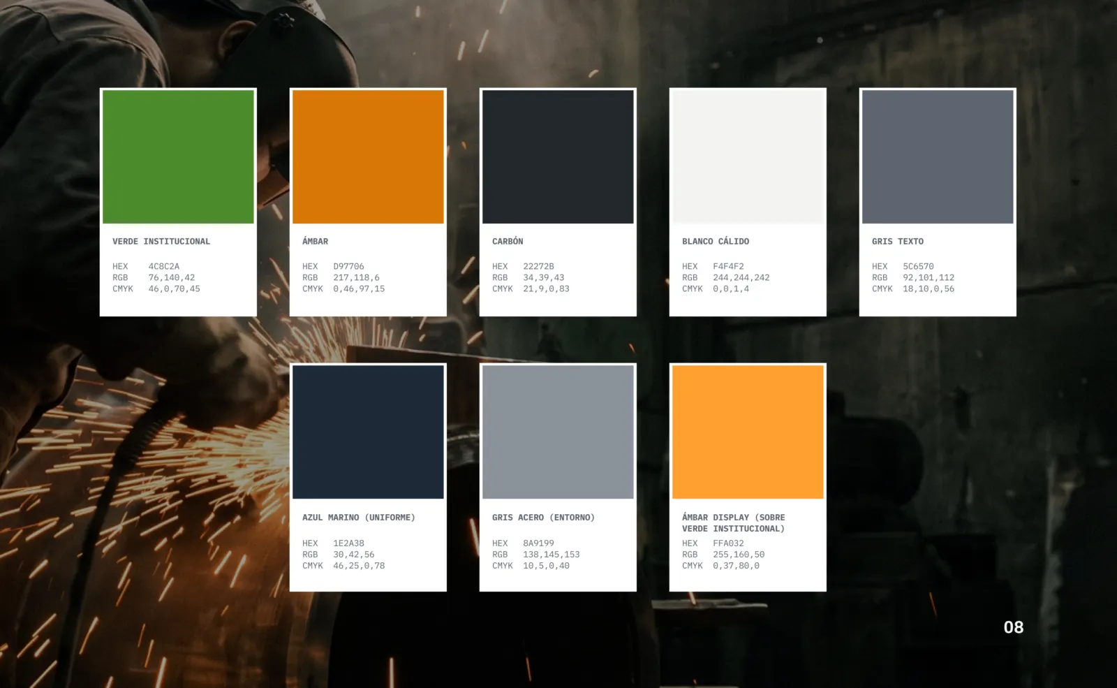
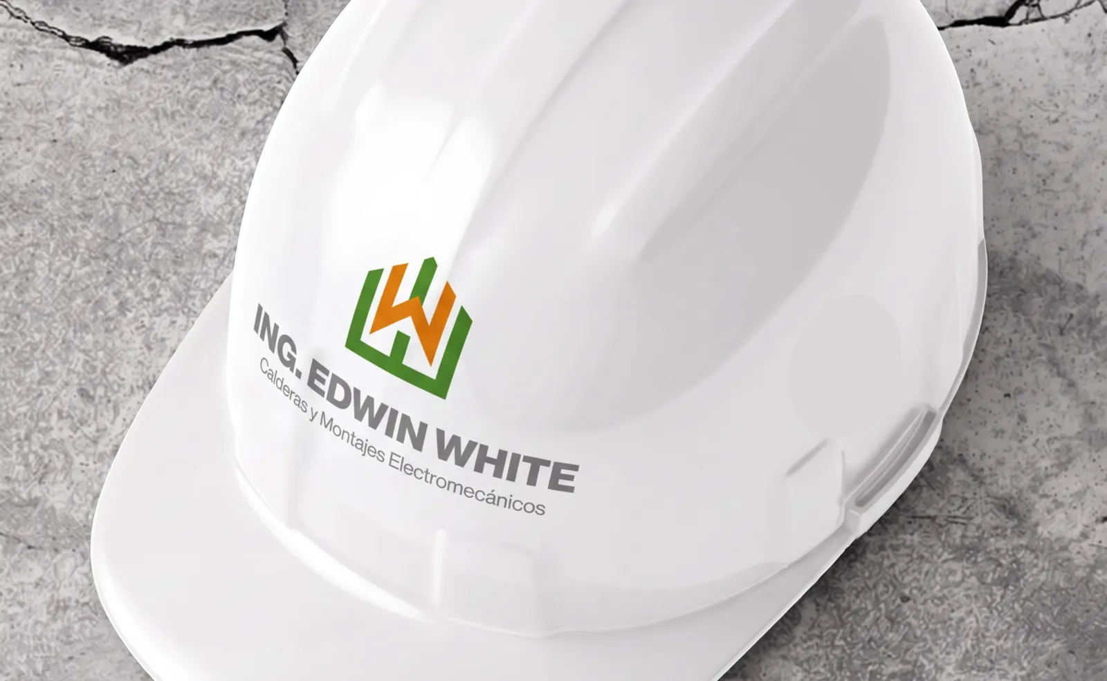
We built a symbol from the W in White and the outline of an industrial plant, on a grid that keeps it legible embroidered, printed or painted. We paired it with an institutional green, a safety amber and two technical typefaces.

The symbol in its four color combinations.

The goal

Evolve the image without losing 25 years of recognition, and move away from industry clichés: no flames or gradients, just a clean identity that works on a truck as well as on a WhatsApp icon.
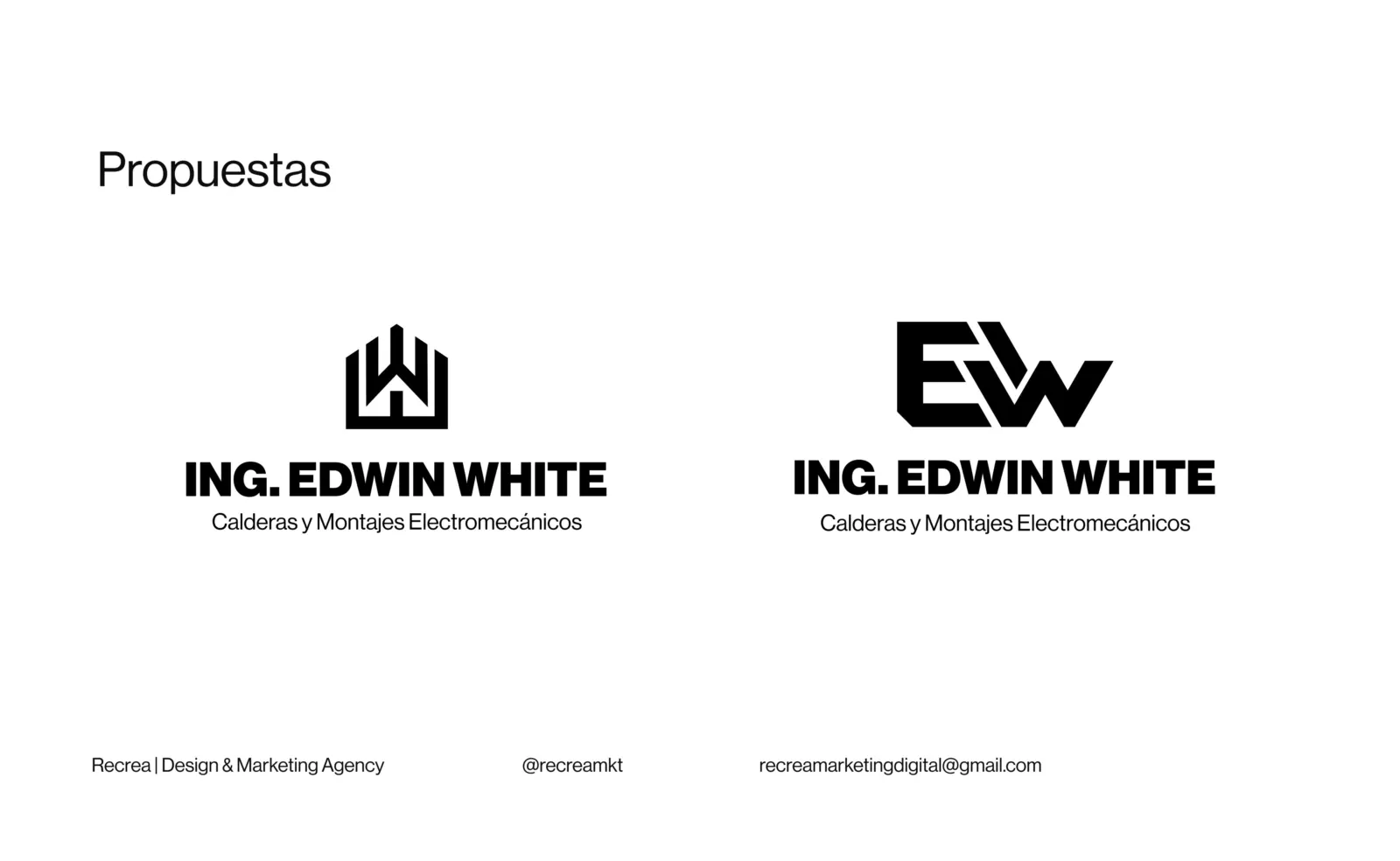
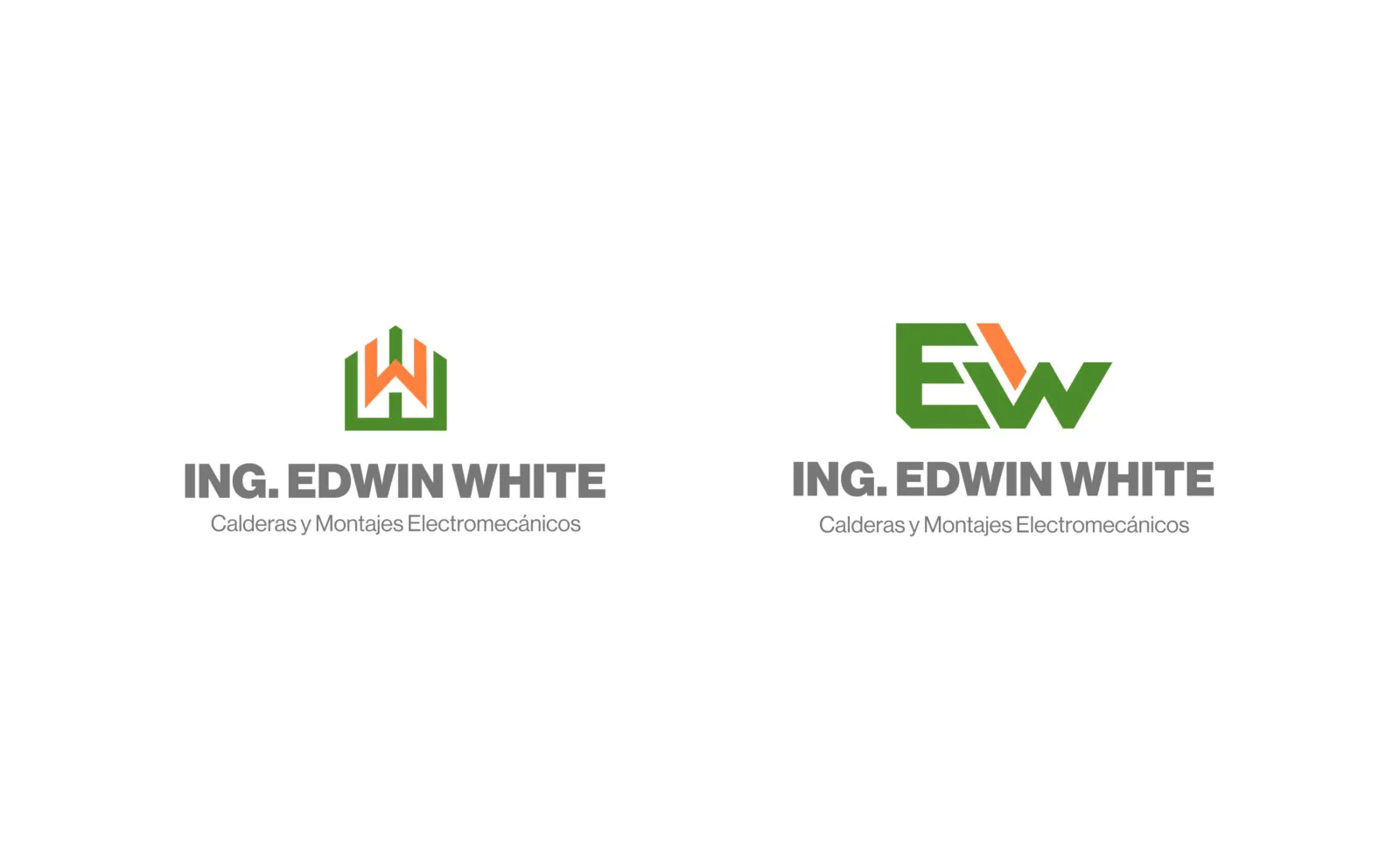
The two directions we presented to the client.
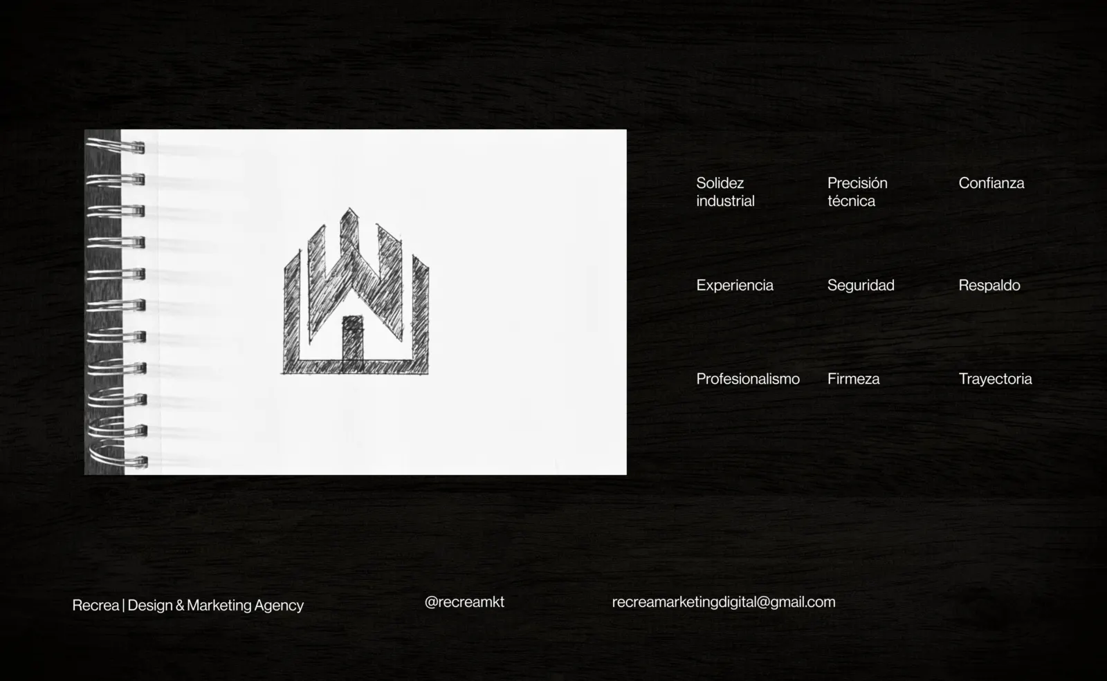
First sketch of the symbol and the values it had to convey.
Both proposals in color.

The symbol

The W in White rises like an industrial building. Straight lines and firm angles speak of precision and structures that hold.
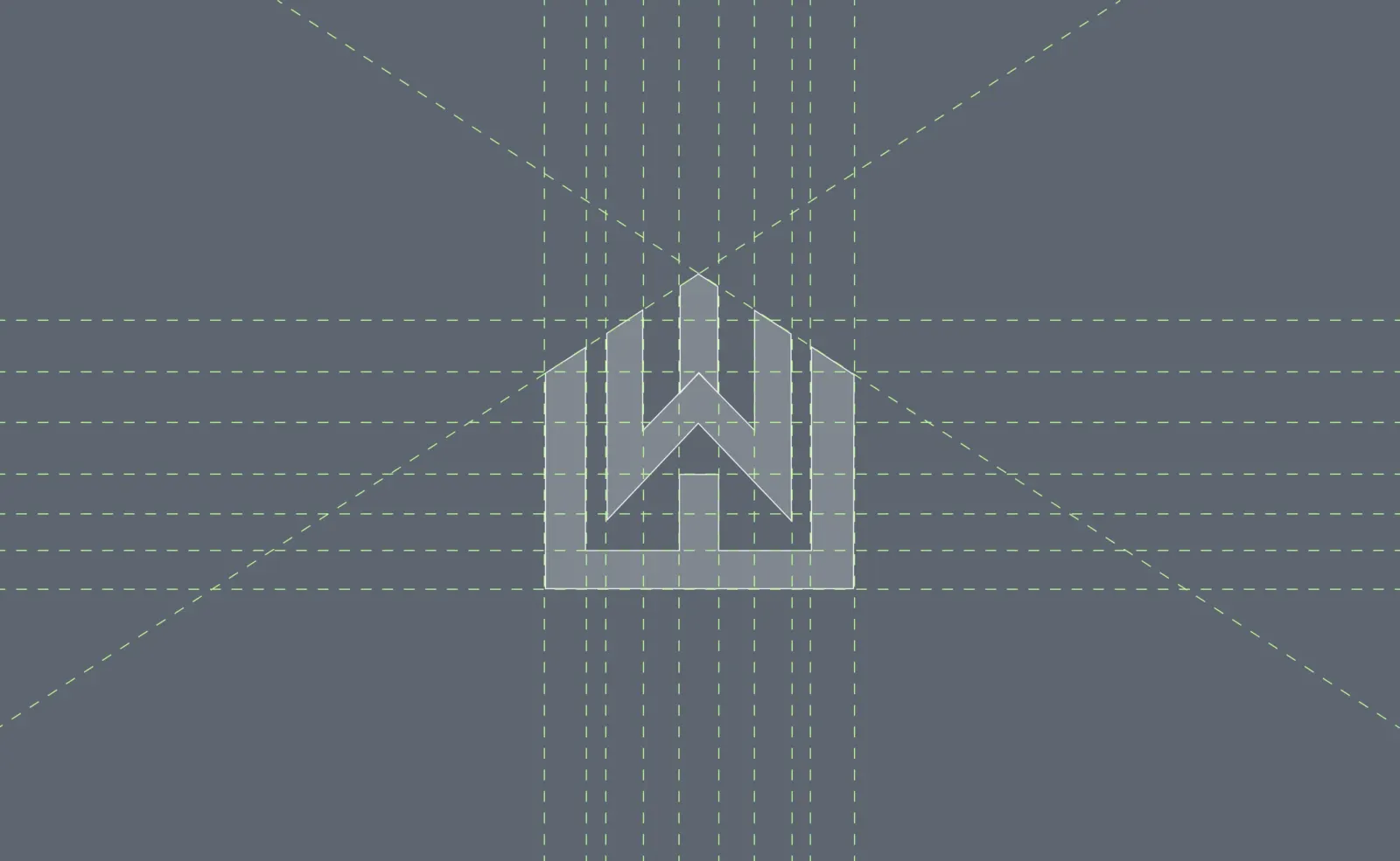
Construction grid for the symbol.
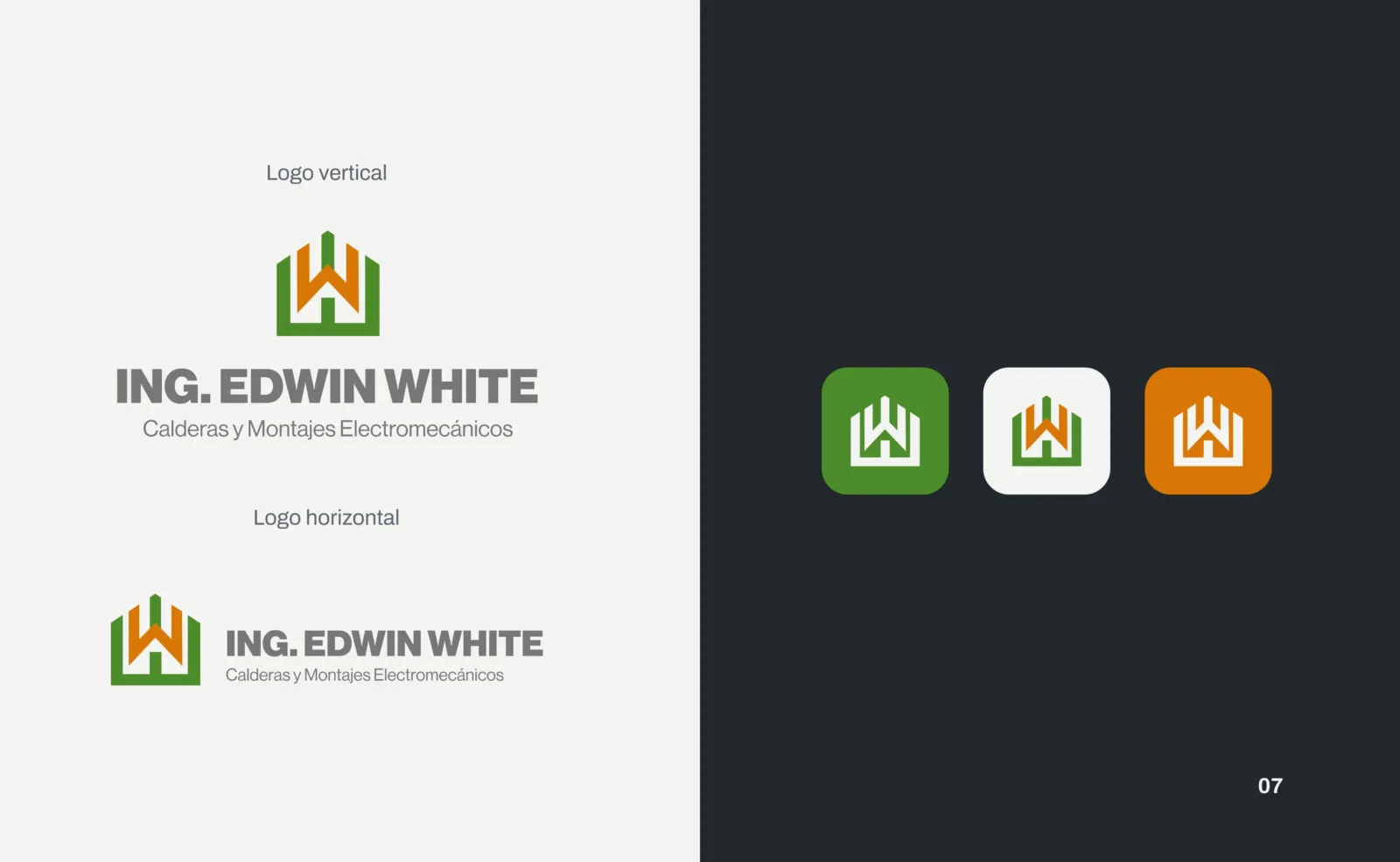
Vertical, horizontal and icon versions.
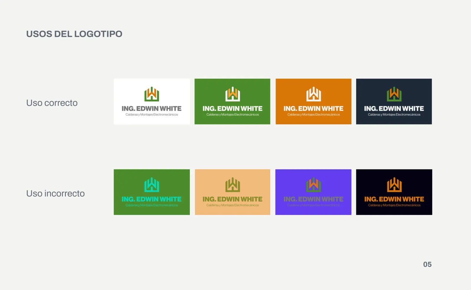
Correct and incorrect logo usage.
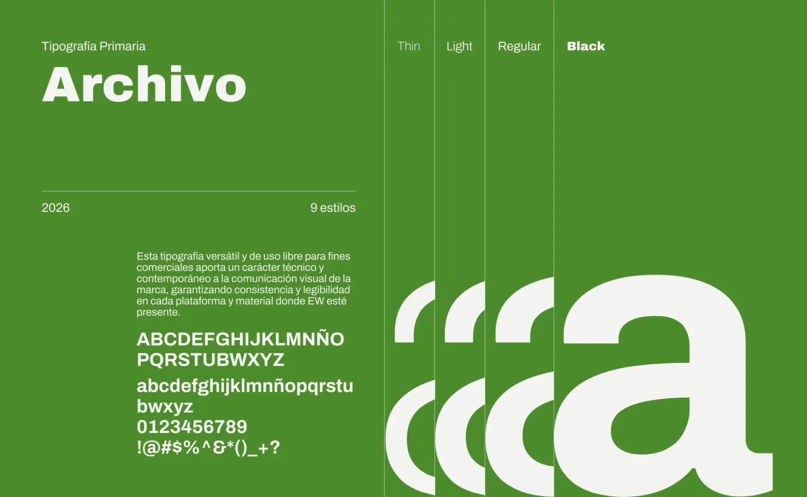
Archivo, the primary typeface.
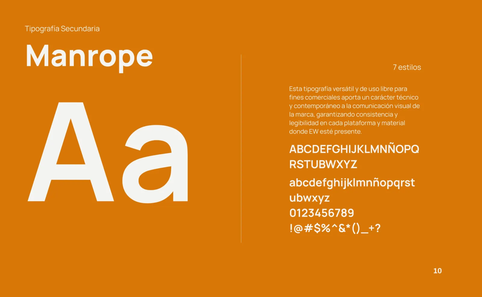
Manrope, for body copy and documents.
Core and supporting palette.
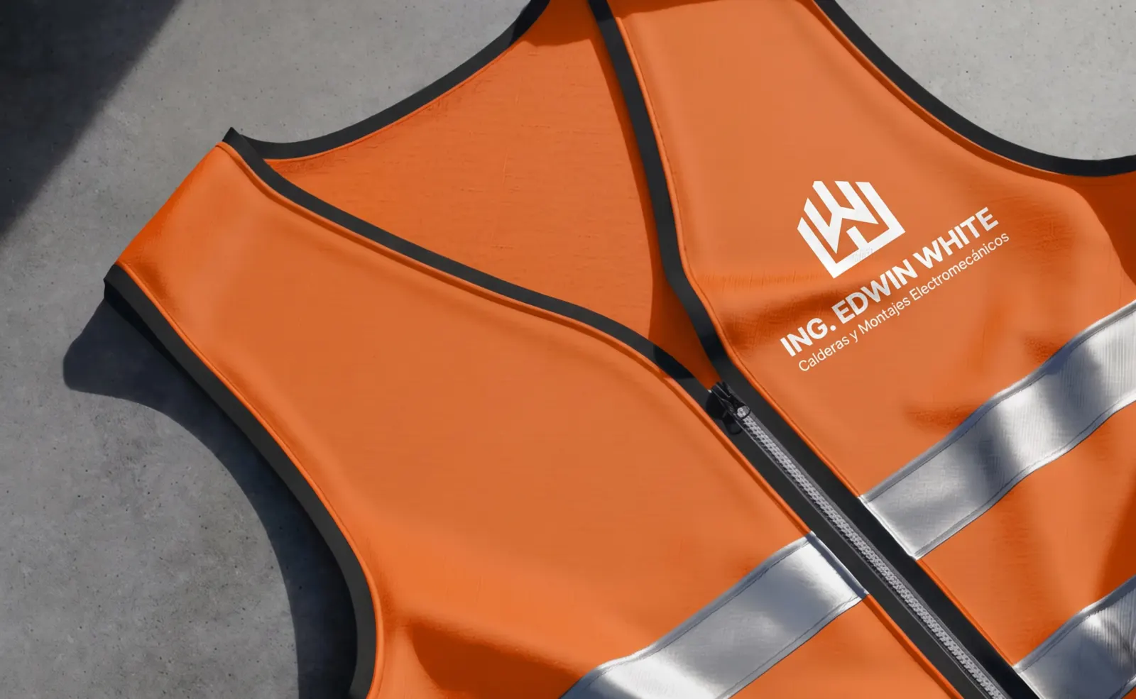
Safety vest.
Safety vest.
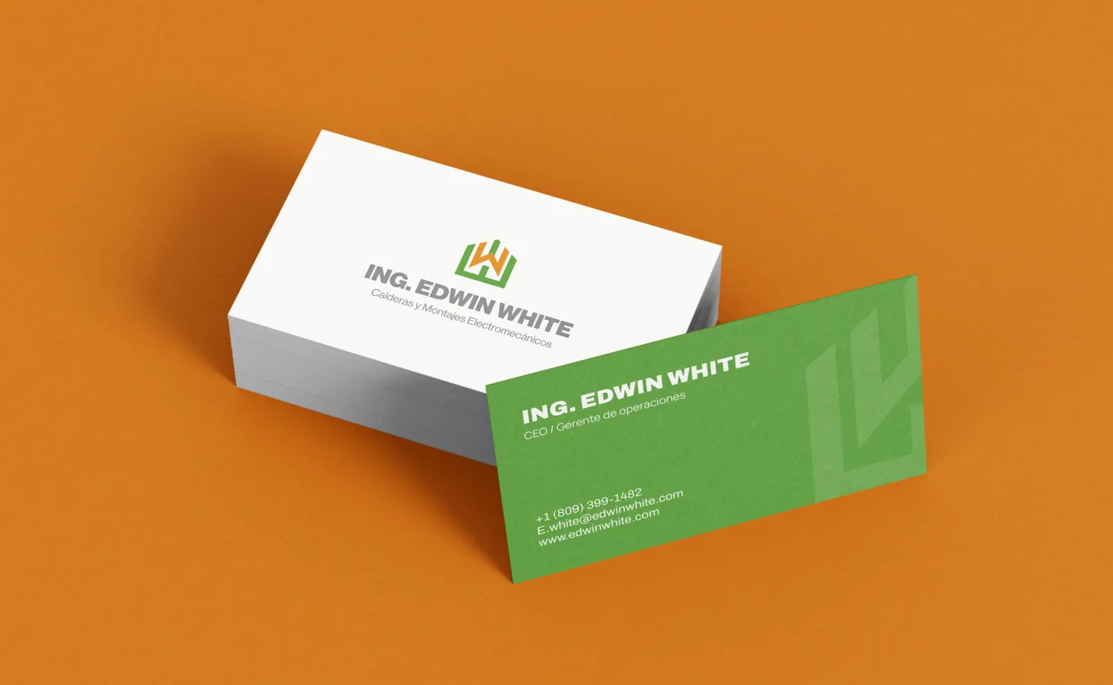
Business cards.
Business cards.
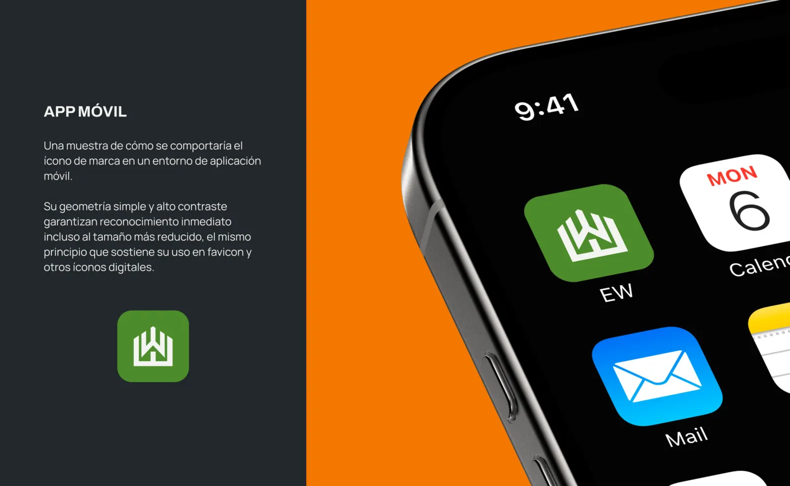
The icon on a phone.
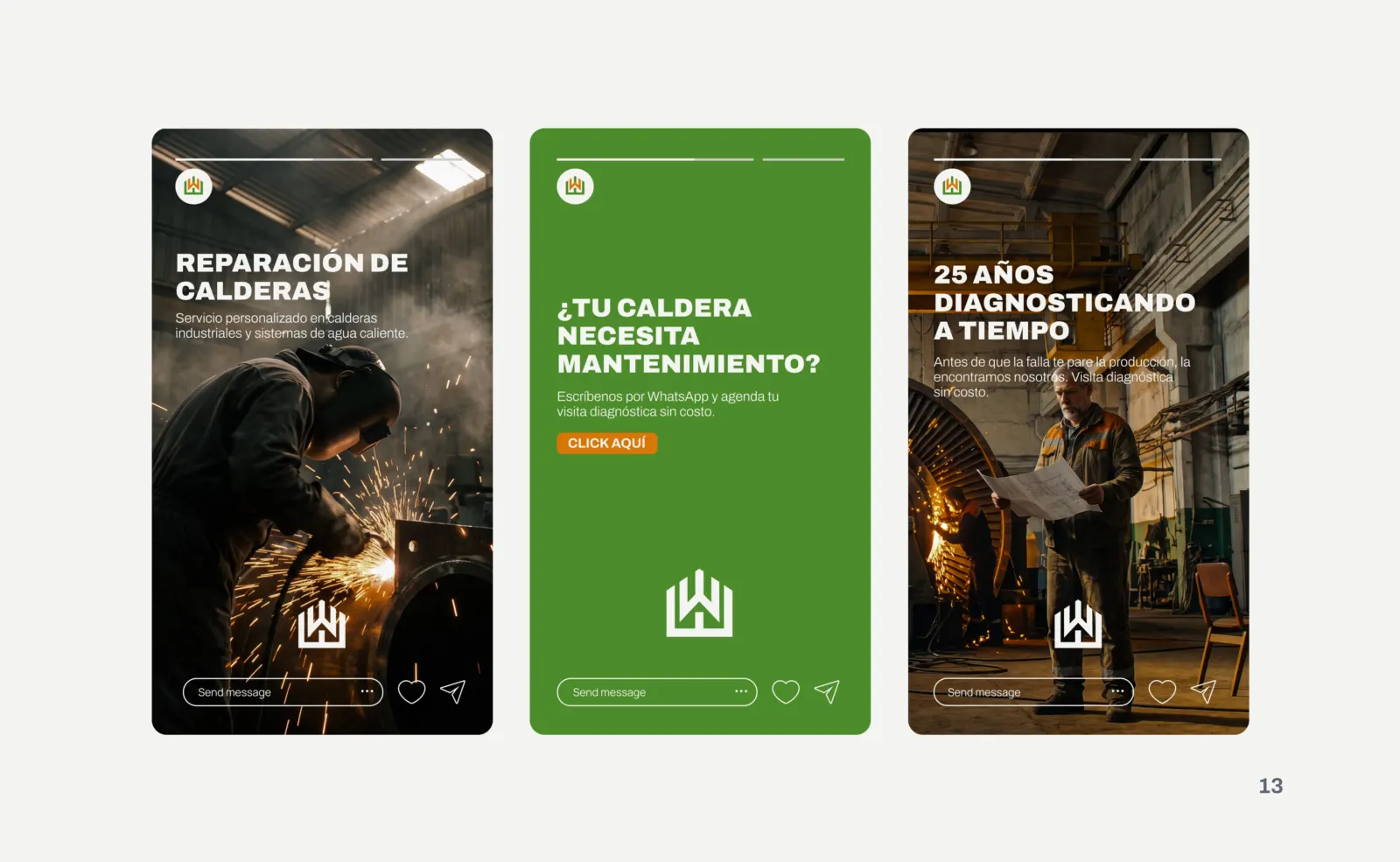
Instagram stories that invite clients to book a diagnostic.
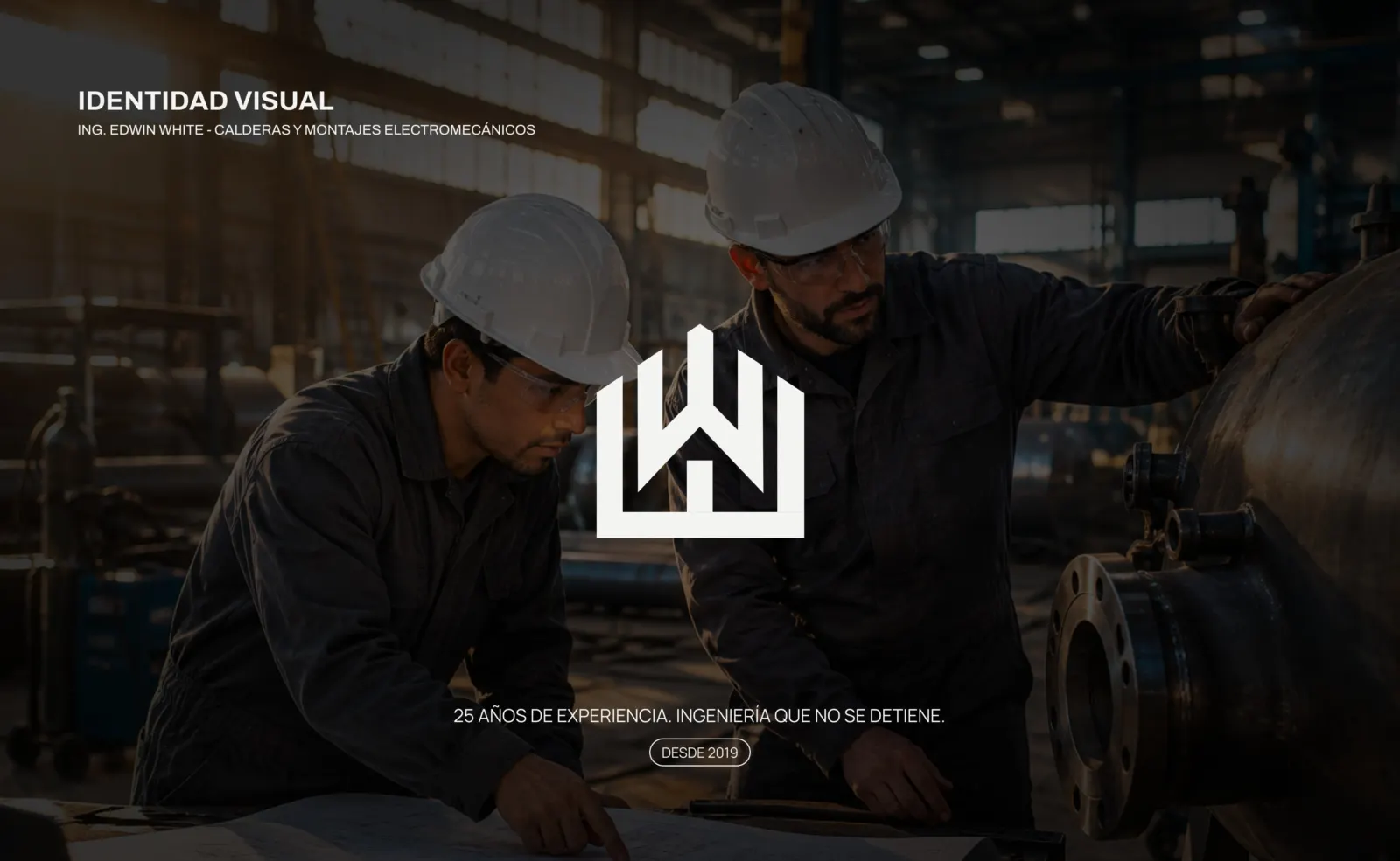
Brand presentation cover.

3.0 Outcome

Today the crew shows up to every site with matching uniforms, helmets and cards, and the social campaigns already bring in diagnostic requests through WhatsApp.