SRBC
The industry is full of look-alike brands: cold blues, crosses and generic silhouettes. SRBC needed to stand out to patients who compare very carefully.
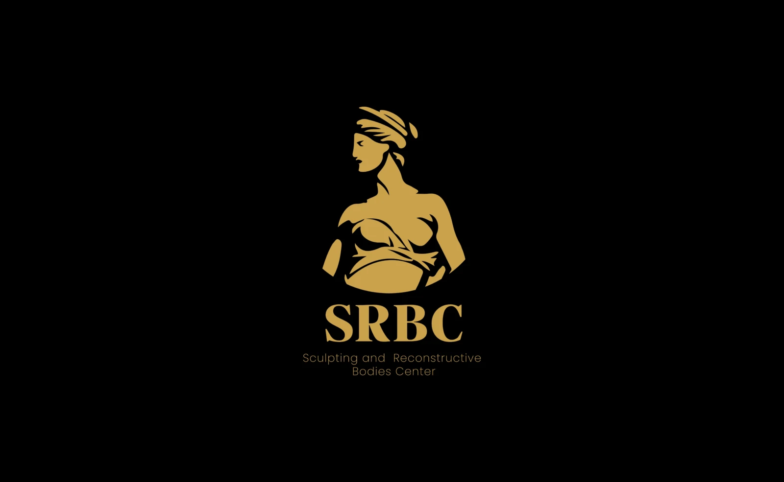
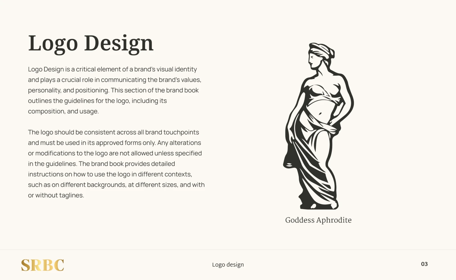
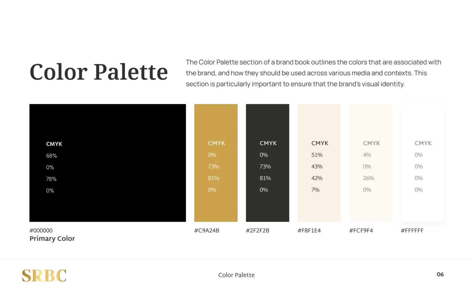
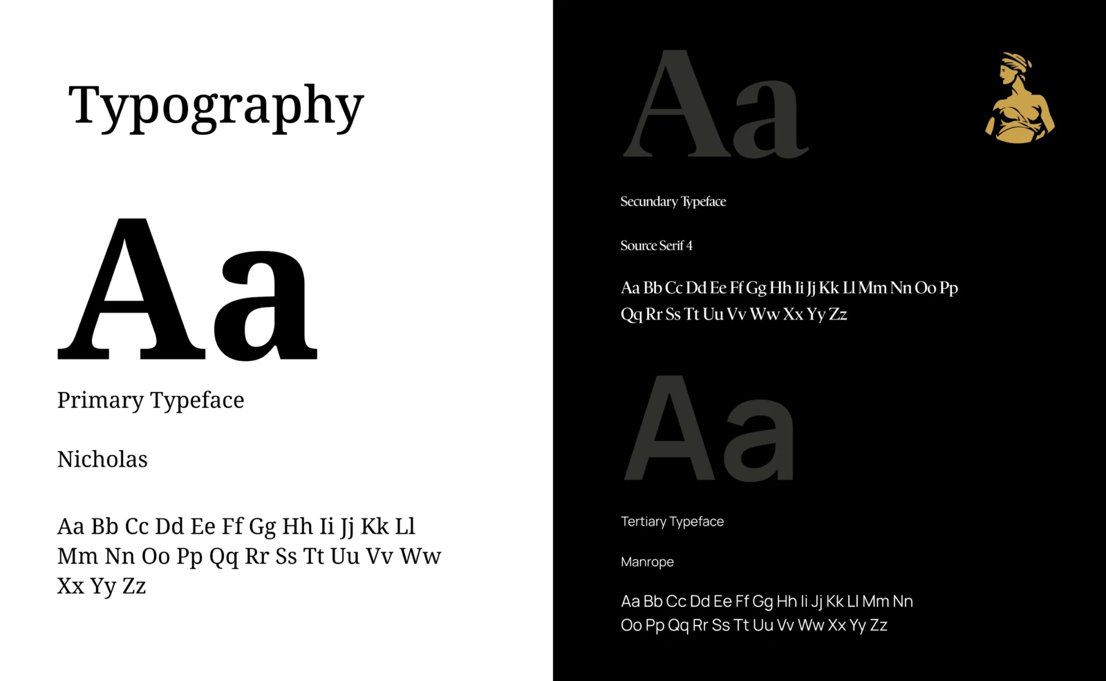
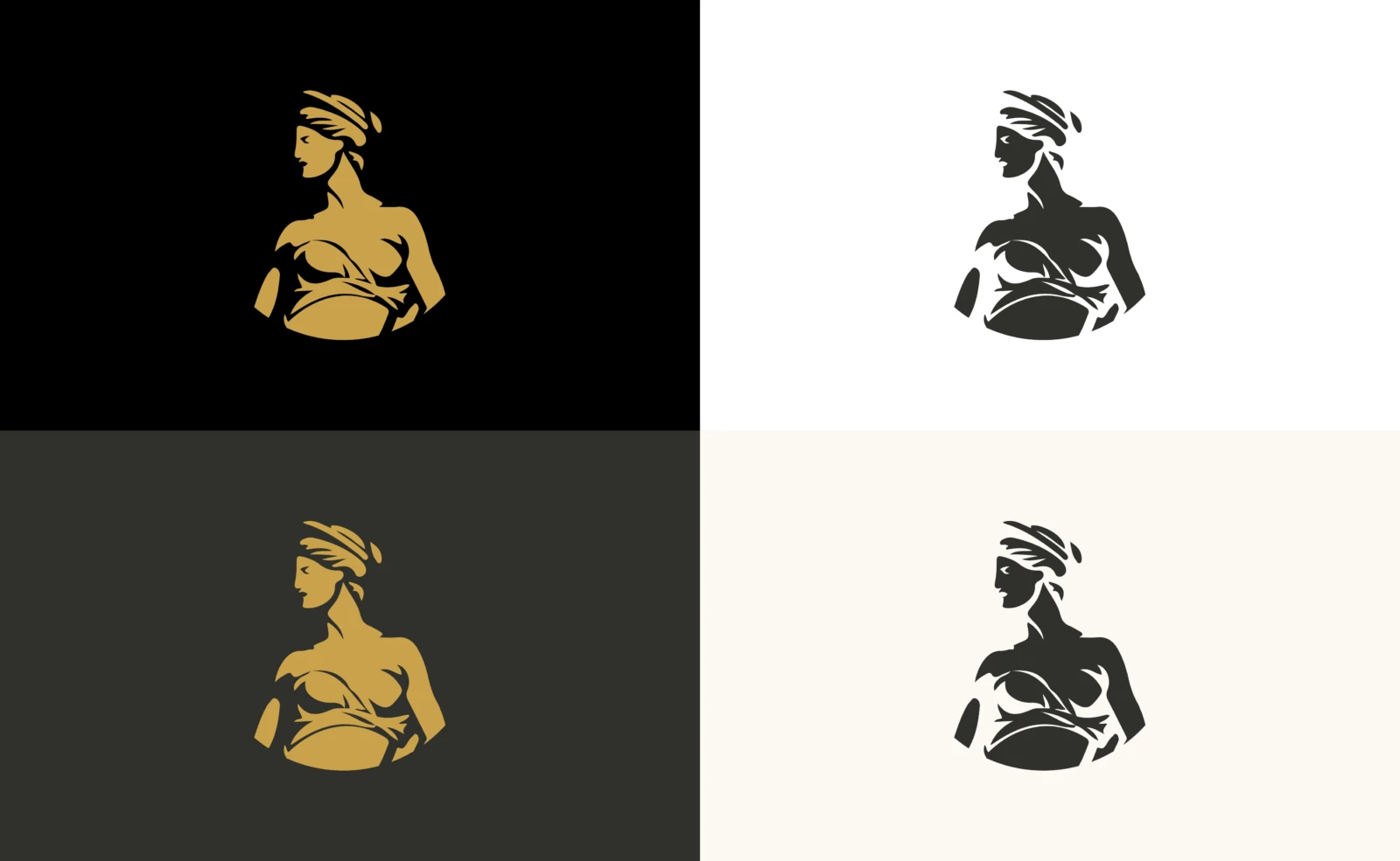
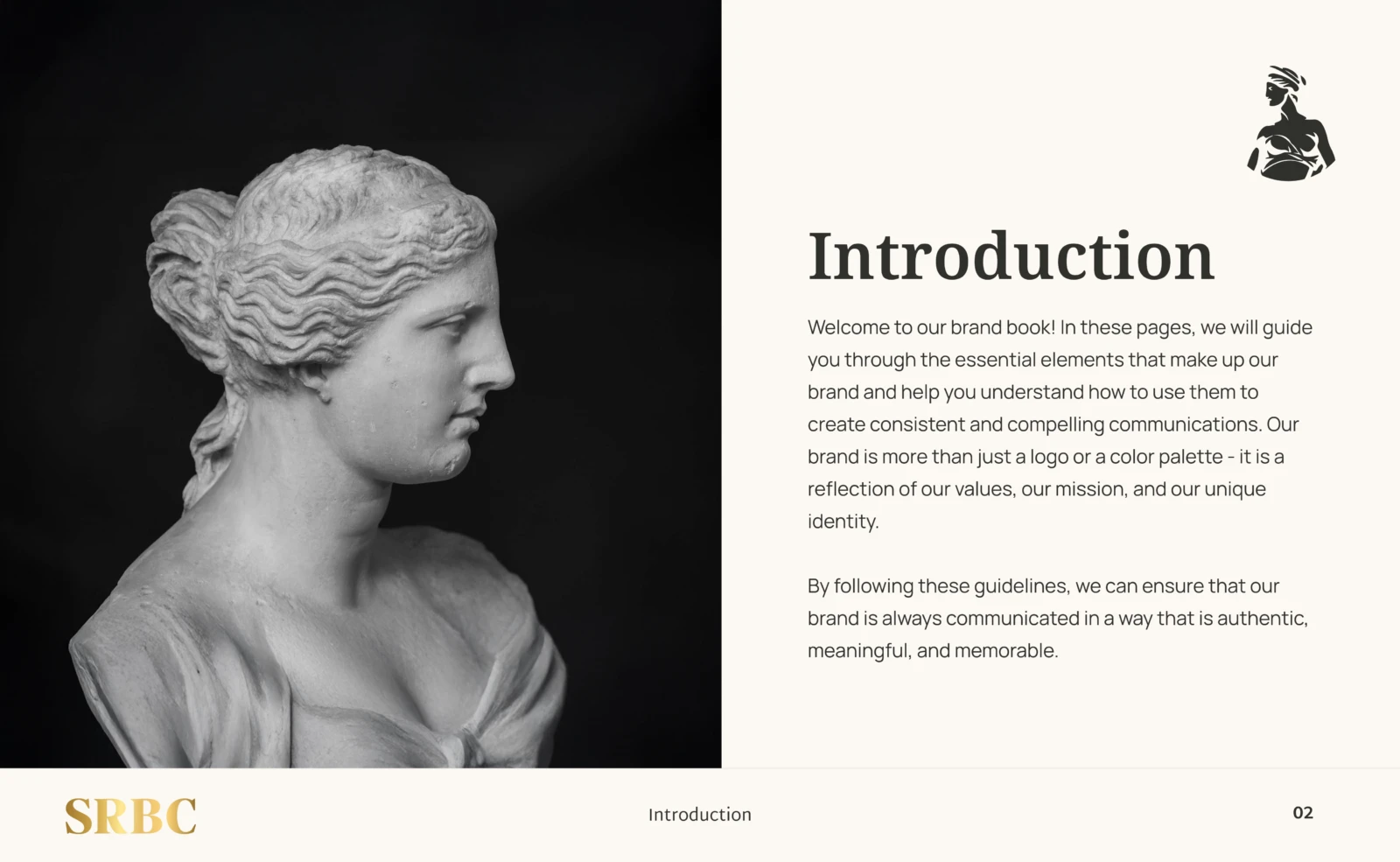
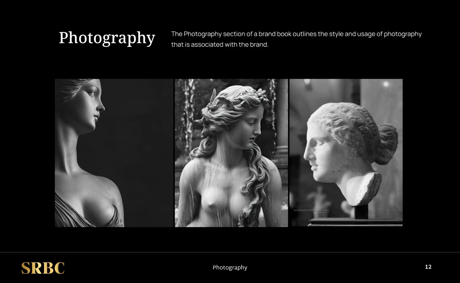
We drew on classical sculpture and Aphrodite to create a bust that stands for beauty sculpted with precision. We paired it with deep black, gold and a serif typeface for elegance.
The idea
Surgery as sculpture: precision, proportion and respect for form. That is why the symbol comes from a Greek goddess, not a medical icon.
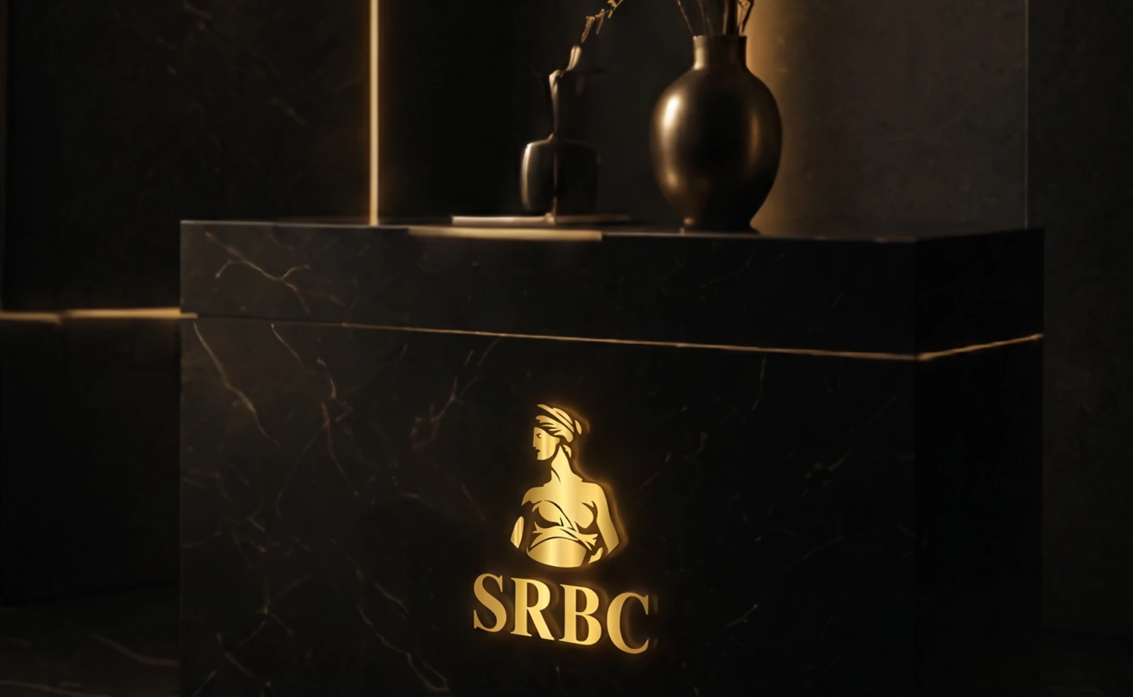
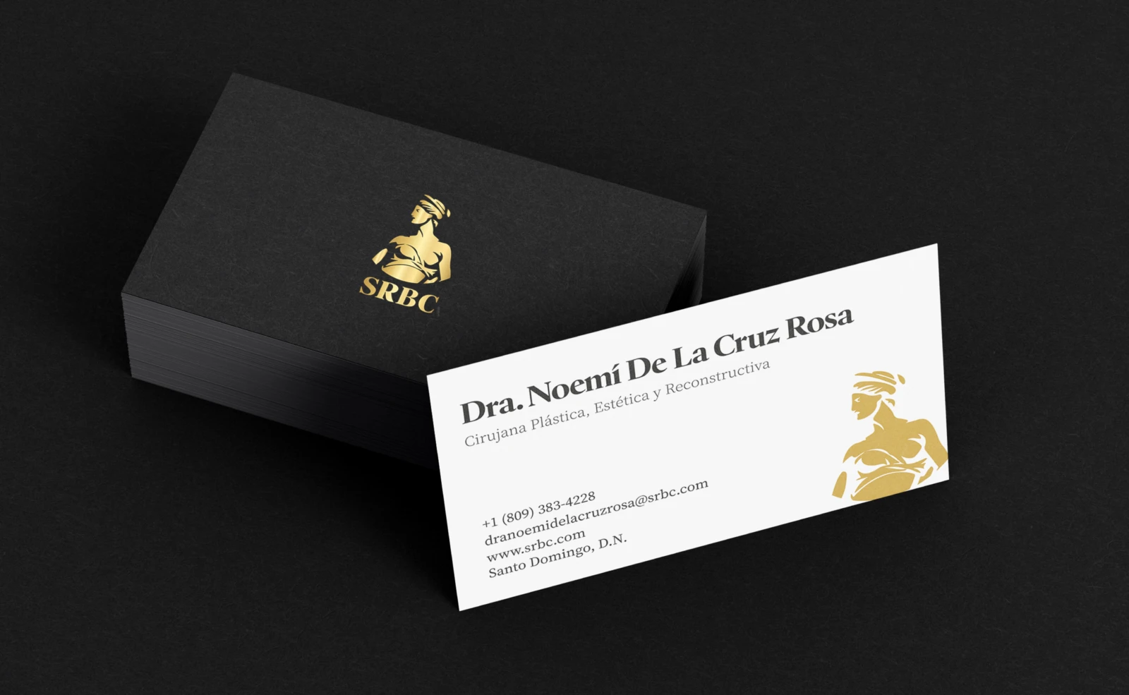
The brand gave the center a consistent premium language across the clinic, cards and social media, in line with the level of its procedures.