La Esquina Dominicana
The food was excellent, but the image didn't say where it came from. The goal: become a Caribbean food and culture landmark in Cleveland and grow its community online.
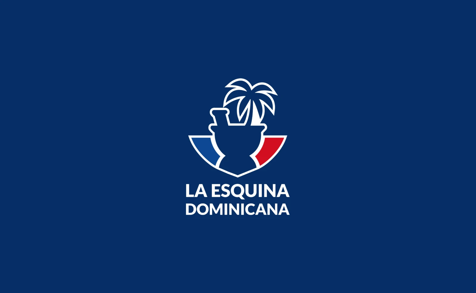
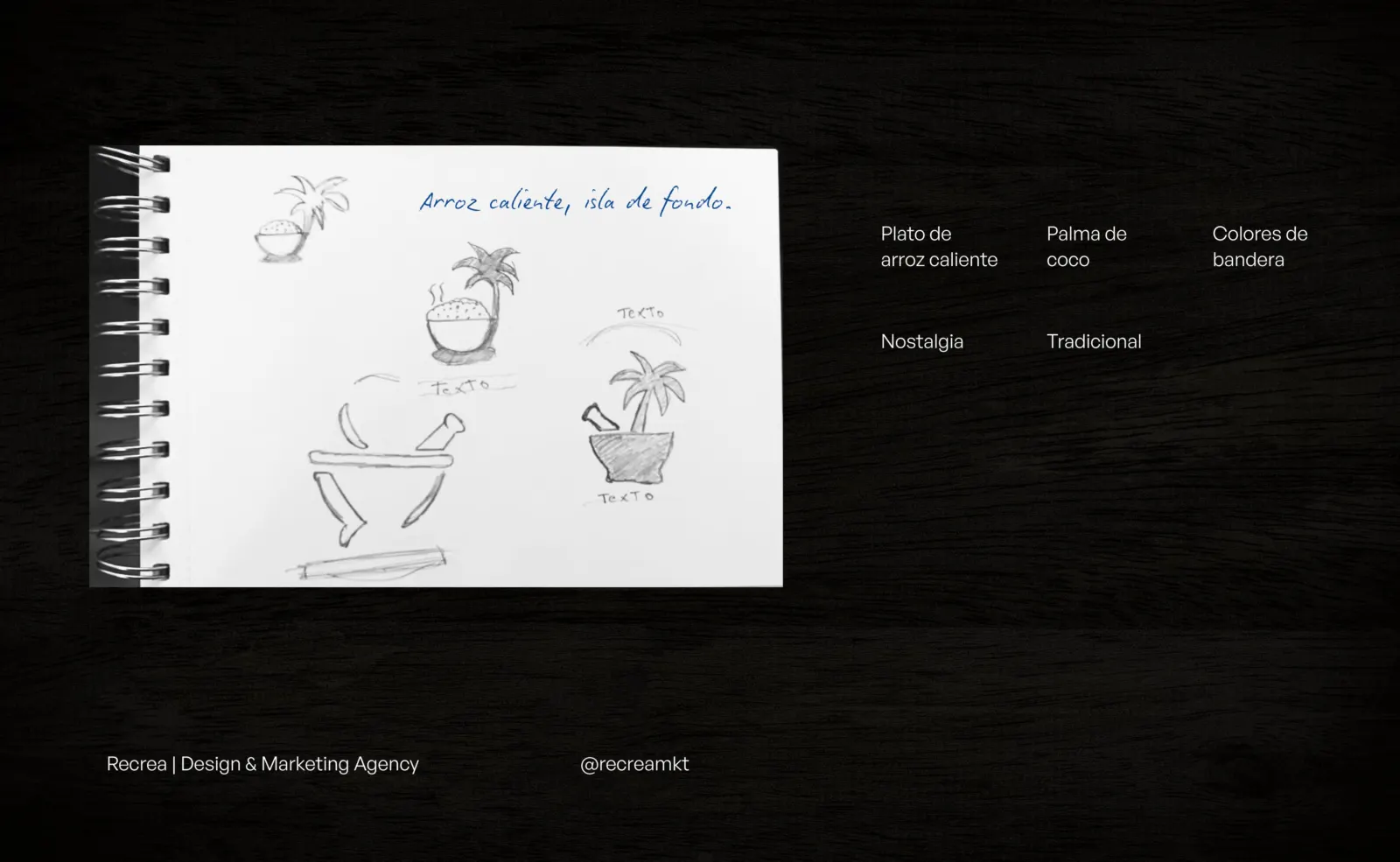
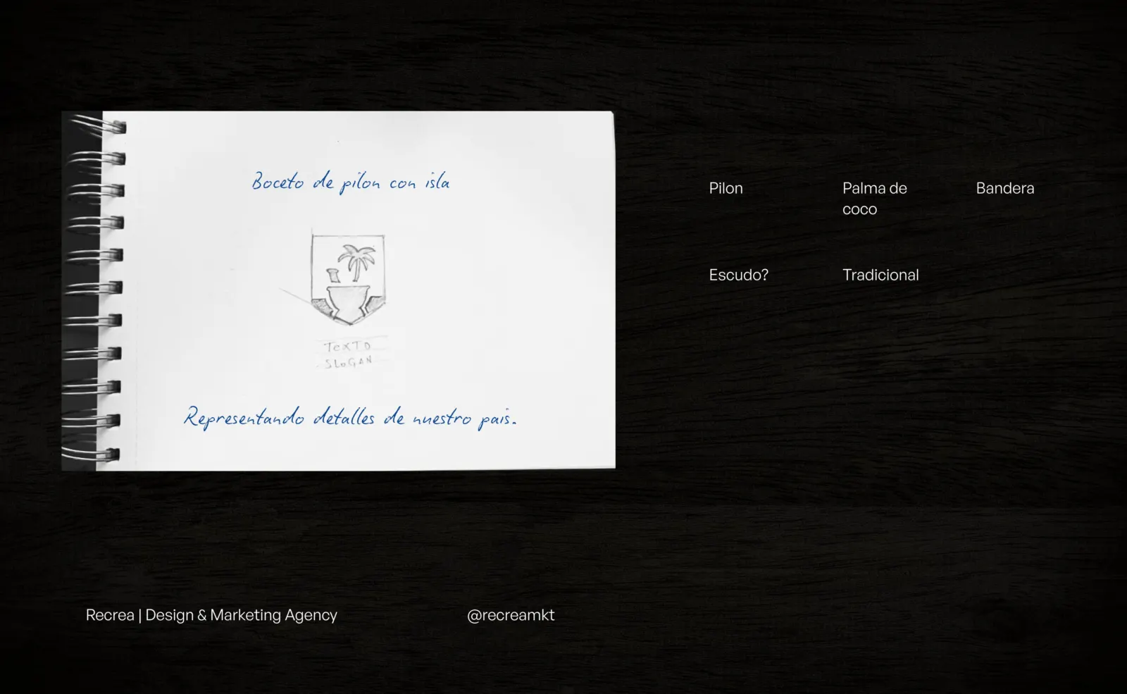
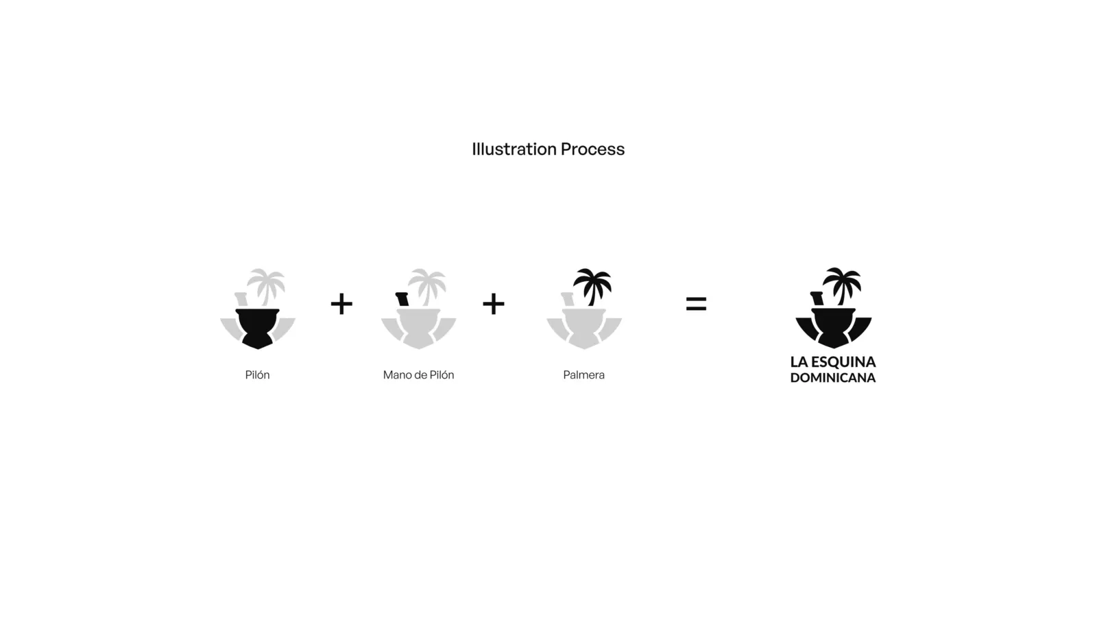
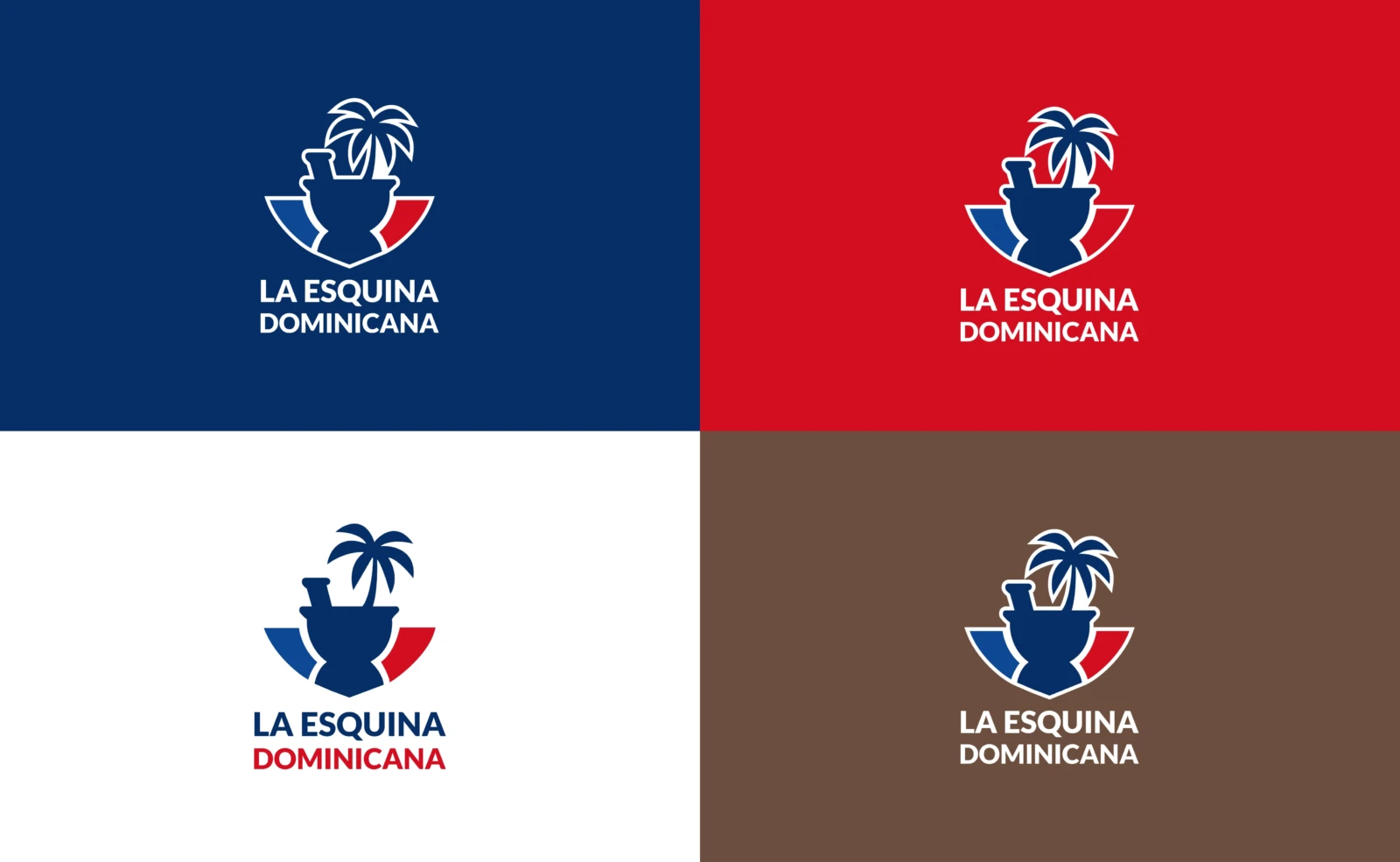
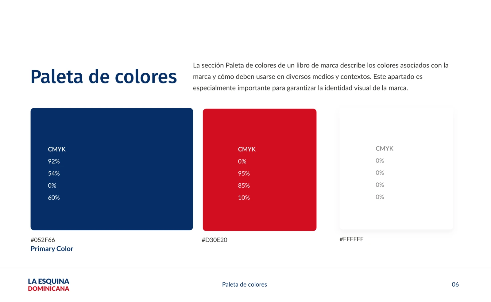
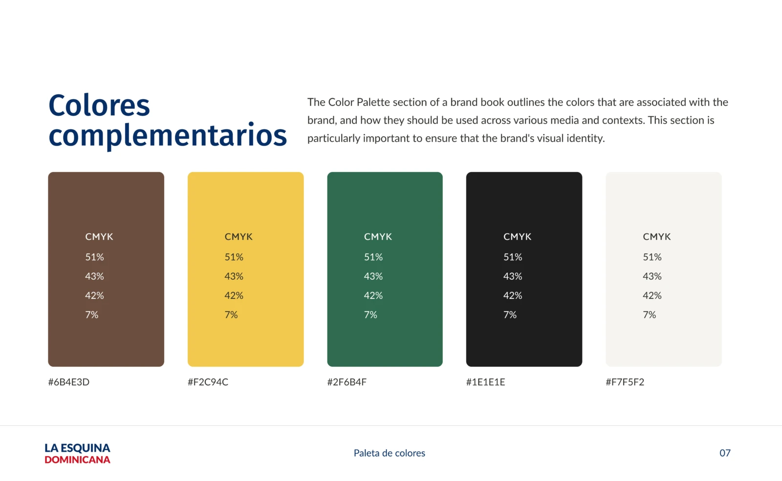
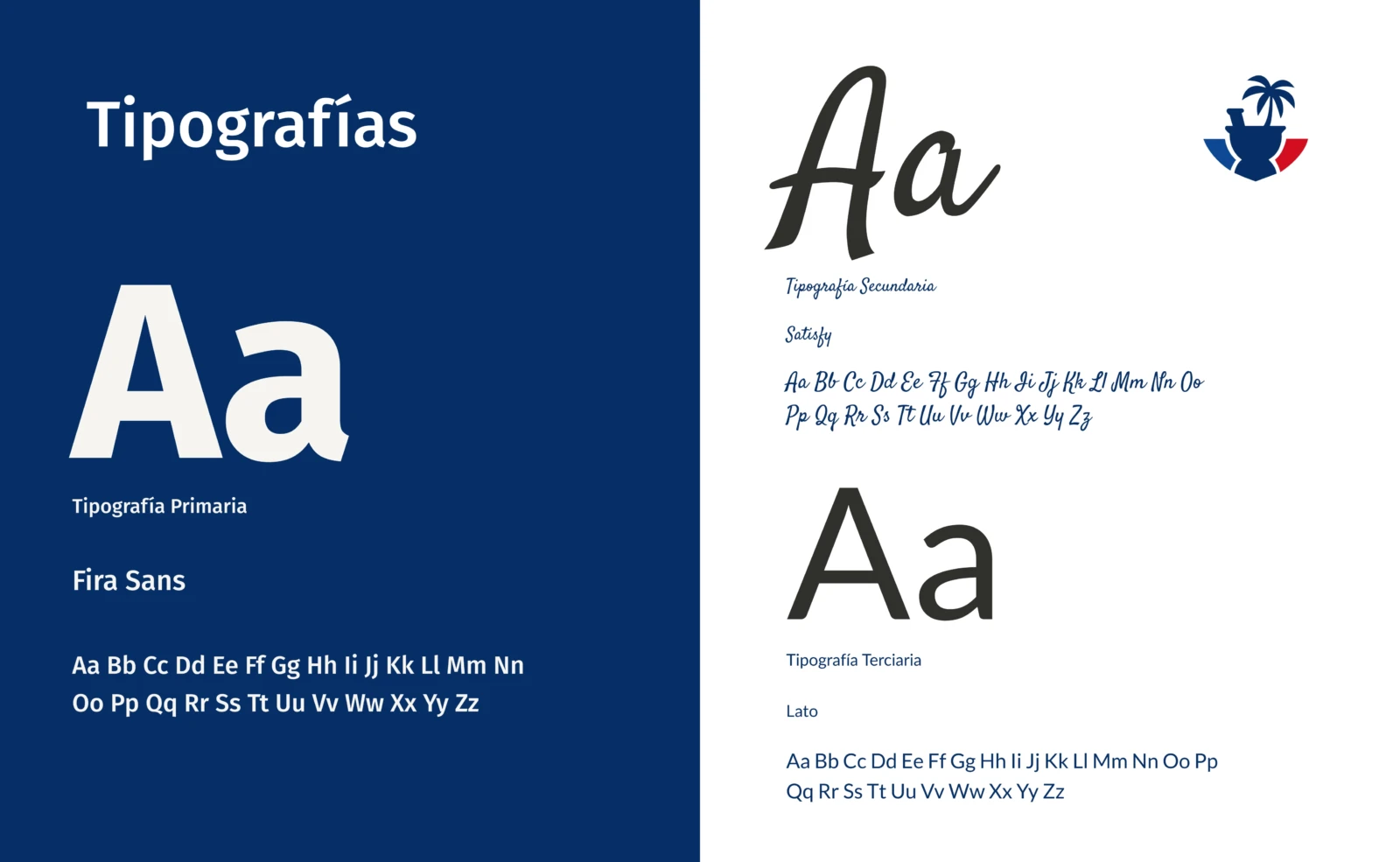
We sketched a plate of rice, the island and the pilón (mortar) by hand until we reached a simple symbol: a pilón with its pestle and a palm tree, wrapped in the flag colors. We completed it with an earthy, kitchen-inspired palette, a handwritten typeface for warm messages and photography of real dishes.
The process
It all started in a sketchbook: hot rice, a coconut palm, the pilón and the national colors. The pilón, the heart of Dominican cooking, became the symbol, crowned by a palm tree.
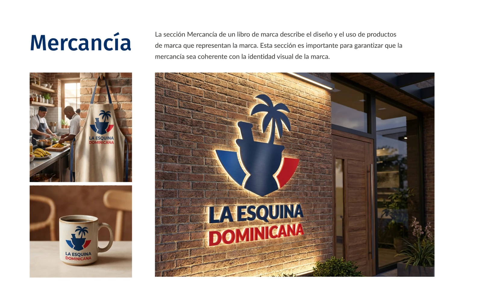
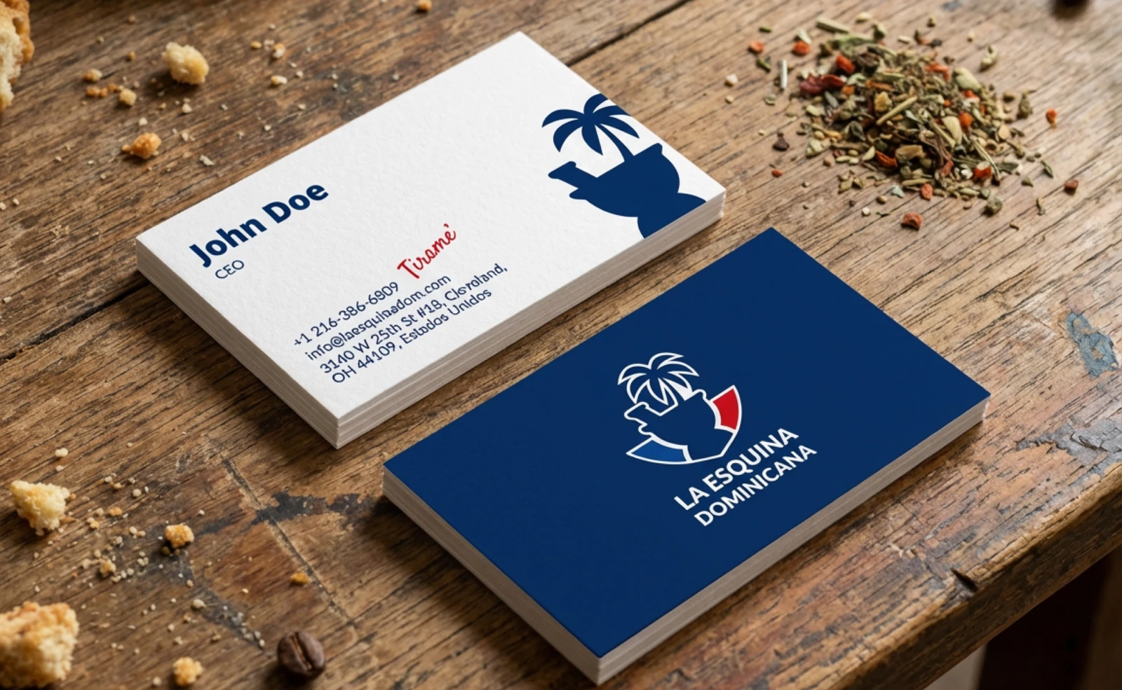
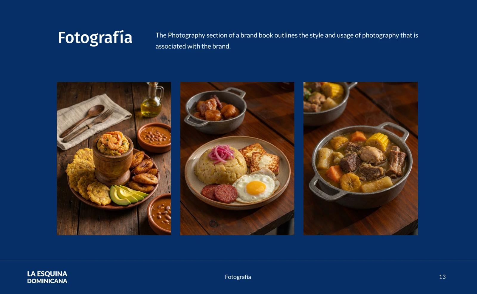
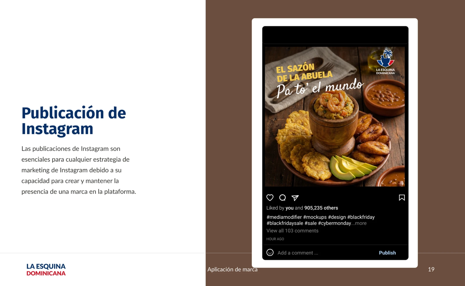
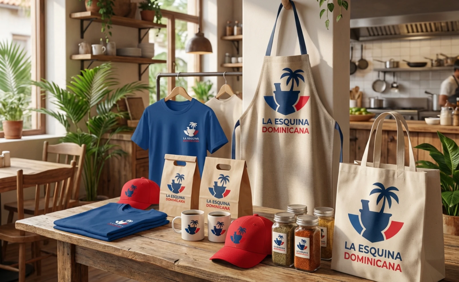
The brand now lives on aprons, caps, sauces and bags, and the Instagram profile looks as good as the food.