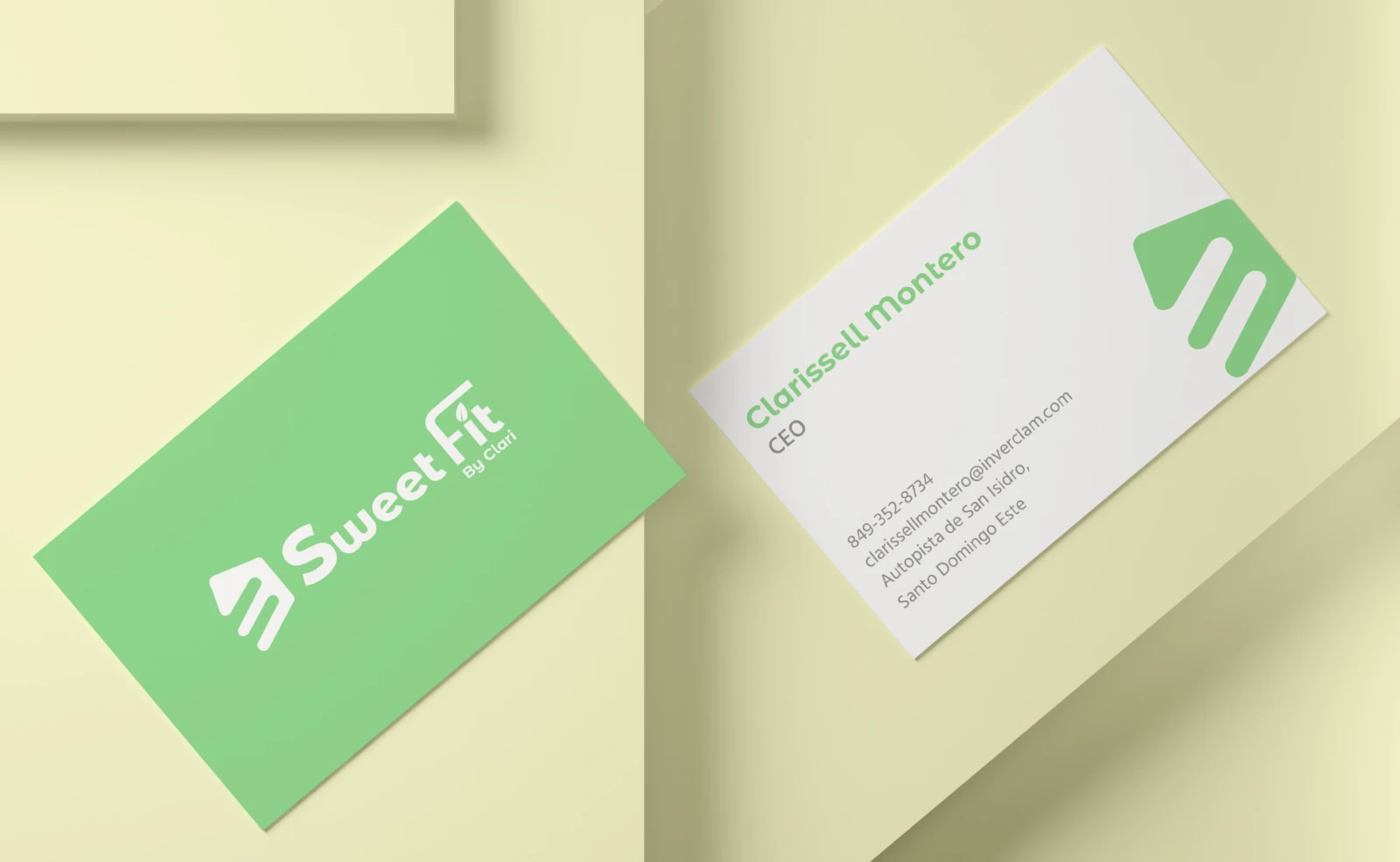
Sweet Fit by Clari

Visual identity, Social media
2024

1.0 The challenge

Healthy desserts often look dull or too diet-like. Sweet Fit had to be as tempting as a traditional bakery.

2.0 What we did

We created a symbol that joins a slice of cake and a leaf, in a vivid green with orange accents. Rounded type and product photos make the brand feel sweet and light at once.
The logo on the brand green.

The symbol

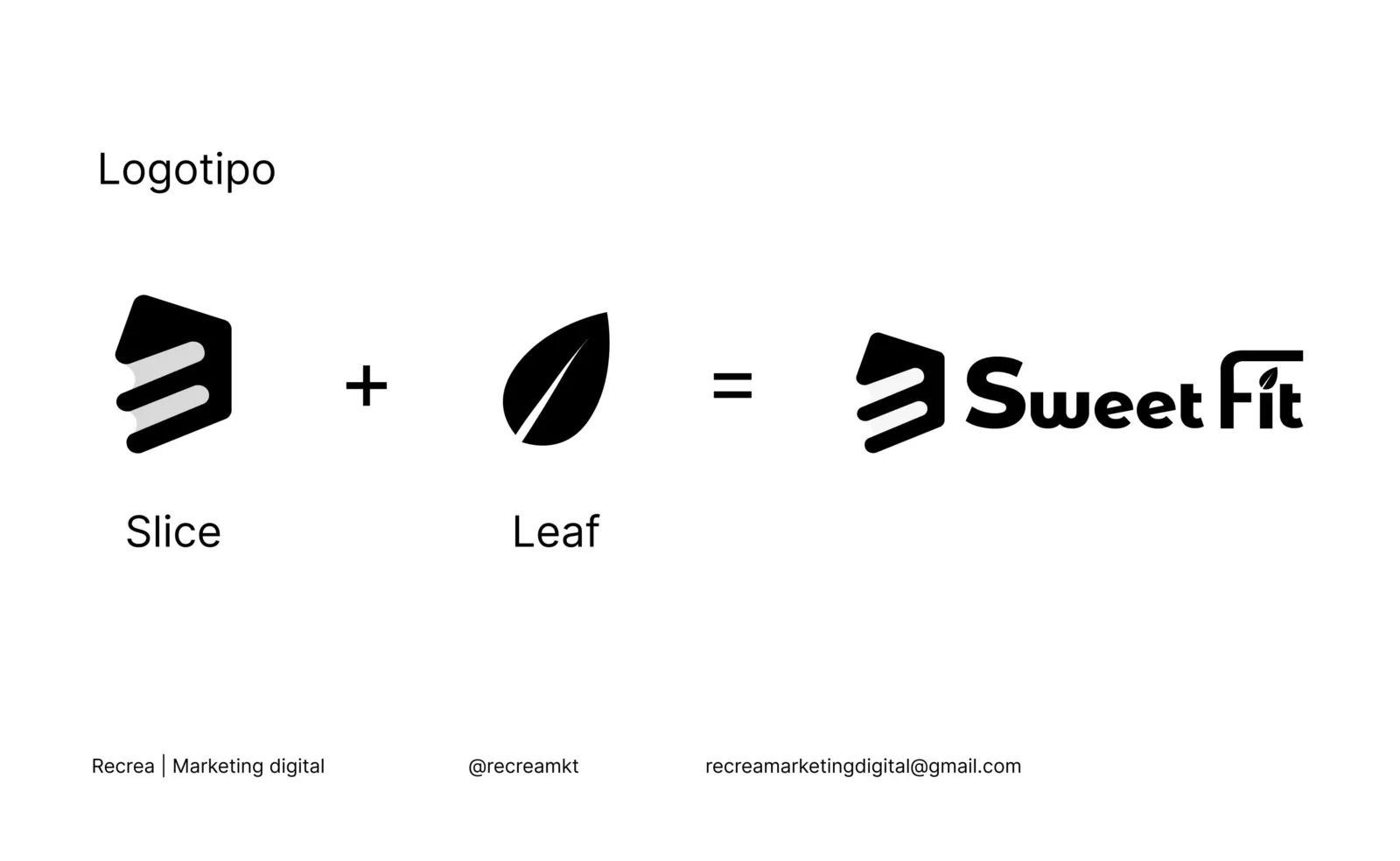
A slice of cake and a leaf in a single shape: sweet and healthy, no explanation needed.
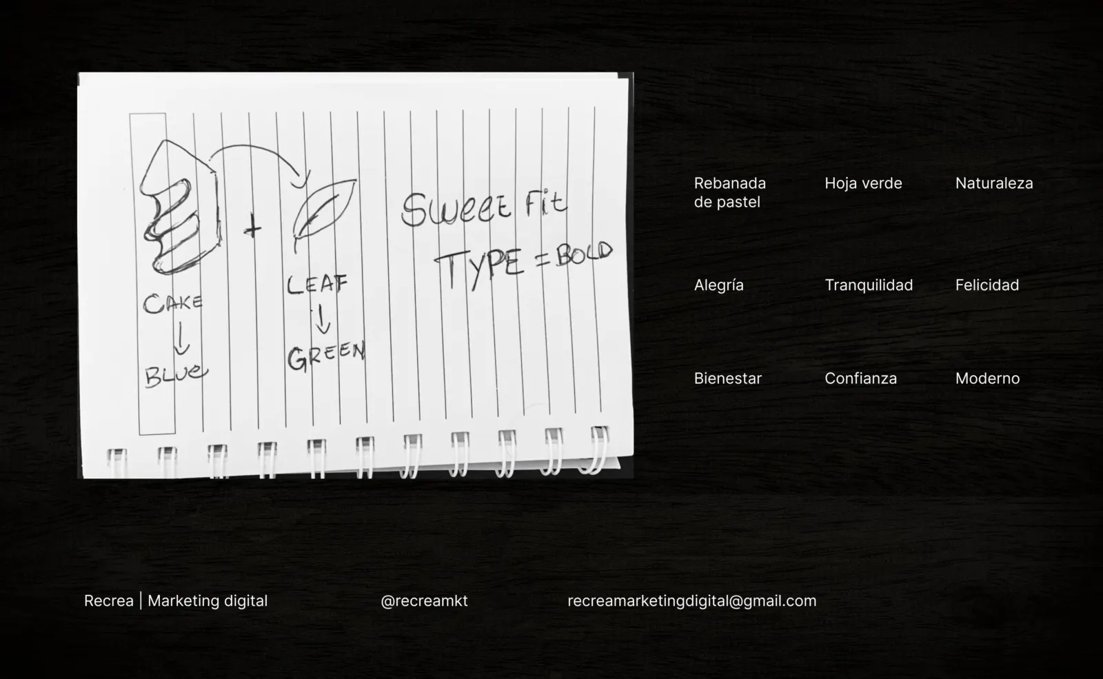
The sketch: a slice of cake, a leaf and the words that guided the brand.
Slice + leaf = Sweet Fit.
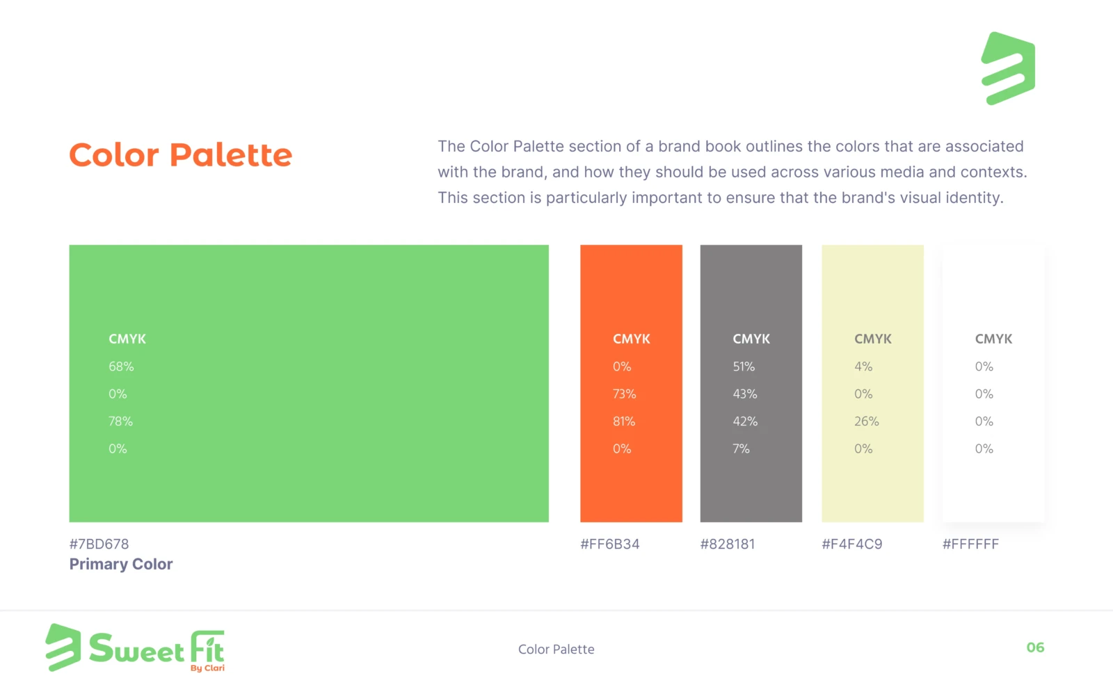
Color palette.
Color palette.
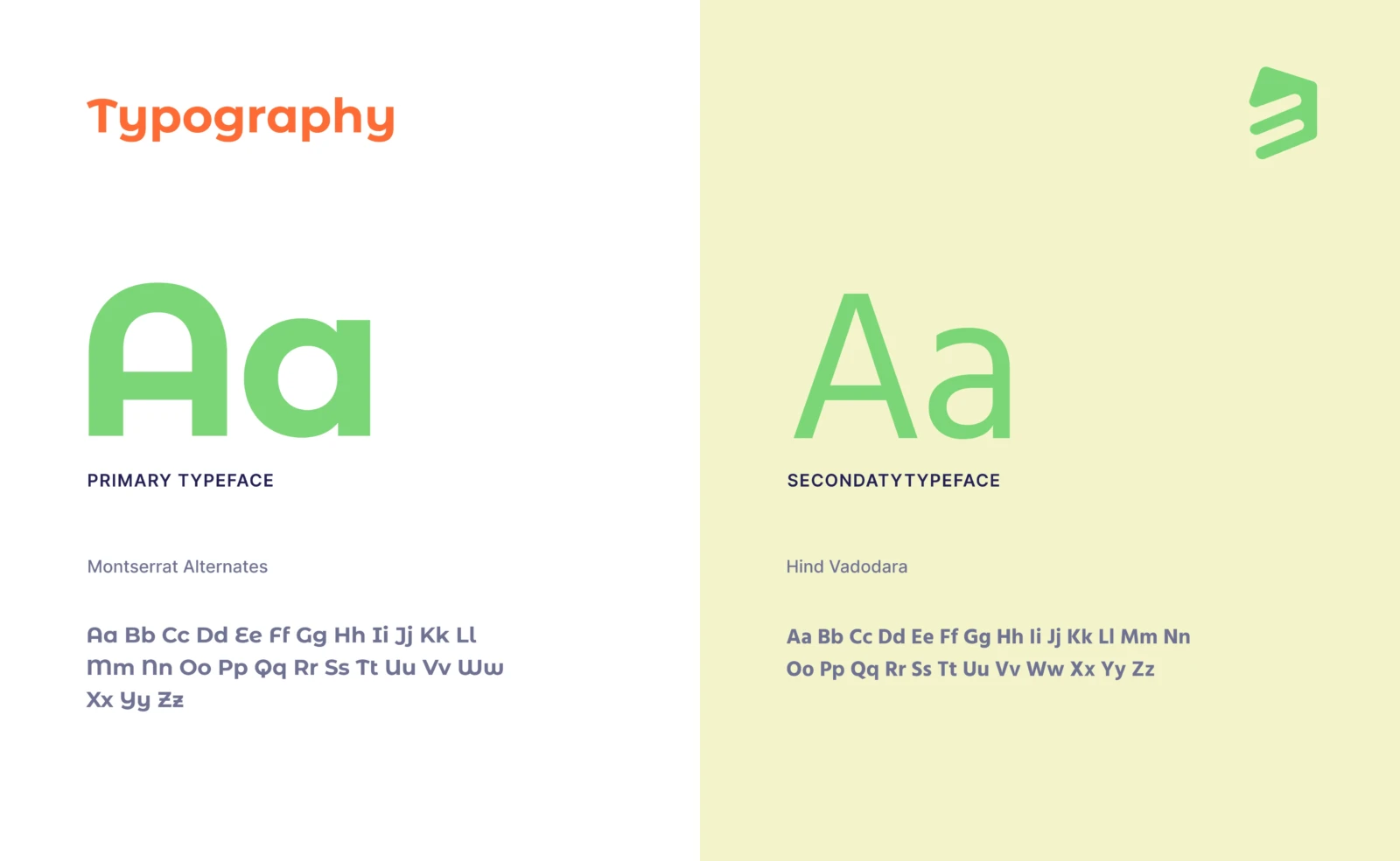
Montserrat Alternates and Hind Vadodara.
The symbol on its backgrounds.
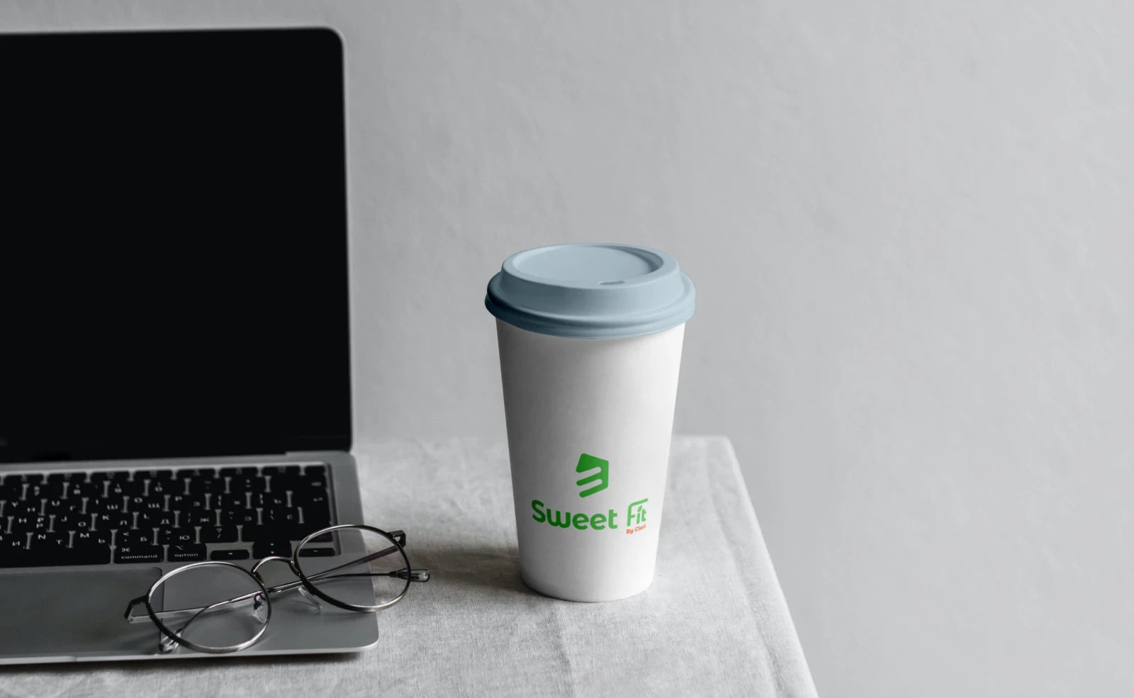
Takeaway cup.
Takeaway cup.
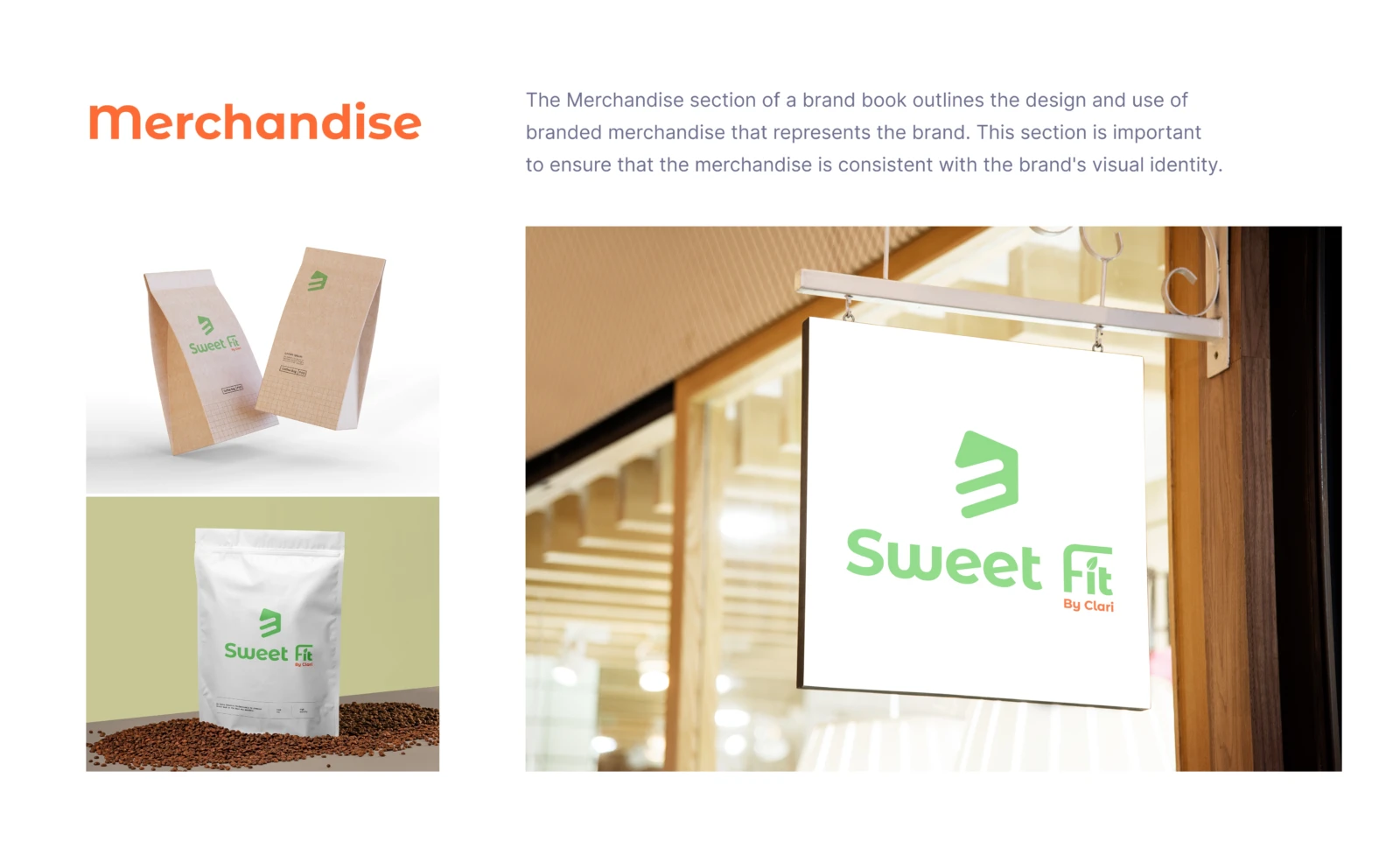
Packaging and sign.
Packaging and sign.
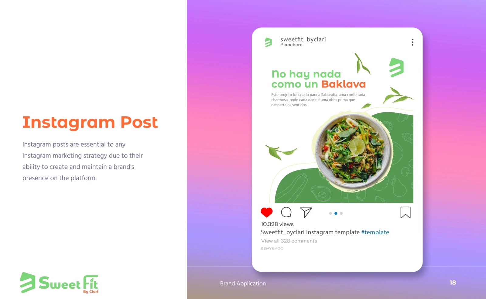
Instagram post.
Instagram post.

3.0 Outcome

With packaging, cups and social media ready, Clari opened her storefront with a brand customers recognize instantly.